Tuesday, March 29, 2011

Oh yeah? I heard...

    
[5:07pm]
K: and the pritzker goes to...
Eduardo Souto de Moura
H: where did you get this? it's not on their website?
K: http://www.scalae.net/noticia/eduardo-souto-de-moura-reciben-el-premio-pritzker-de-arquitectura-2011
K: i think it's a leak...
H: i guess so
H: that link is already not working, after i just saw it one minute ago

[5:21pm]
H: i heard it's Eduardo Souto de Moura
R: i heard that too... but only spain is supporting it...
no newspaper in portugal talks about it...
R: do you think it is a leak or a prank?
H: the official website has nothing
R: i know...
H: could be a leak
i wont be surprised
R: i agree... it's possible. it would be an awful prank for souto de moura. . . .

[5:34pm]
G: pritzker prize?
H: heard rumors...
not sure
G: from where?
H: from a website
scalae or something
but the link doesnt work any more
G: R just showed me
it can't be true
H: could be a leak tho
G: I would be suprised if he won
H: i wont :P
G: really
H: i think this year will be a surprise
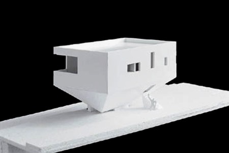
G: but he hasn't really done anything
some houses
H: so he's not much a surprise so it doesnt surprise me, haha
what did glenn murcutt do?
G: true

[5:42pm]
R: it's now starting to spread around portuguese blogs and newspapers...
http://abarrigadeumarquitecto.blogspot.com/2011/03/2011-pritzker-prize-eduardo-souto-de.html
http://5dias.net/
they all confirm that the news are not official...
R: http://featuresblogs.chicagotribune.com/theskyline/2011/03/portuguese-architect-wins-pritzker-architect-prize.html
http://www.cnbc.com/id/42307681
http://latimesblogs.latimes.com/culturemonster/2011/03/eduardo-souto-de-moura-portuguese-architect-wins-pritzker-prize.html

[6:16pm]
R: it's everywhere...
except here: http://www.pritzkerprize.com/
H: haha

[6:24pm]
G: he won
its for real
H: not on the pritzker website yet
G: I know
but it everywhere
archinect
archdaily


[6:29pm]
F: it's been around that Souto de Moura won the pritzker
I can't believe it
it has to be a joke
H: yes i heard
you dont like him?
F: some projects
when he started to design houses upside down I started to hate it
H: hoho
i guess i'll have to make another trip to portugal soon then :D

[7:03pm]
K: now it's official as a whistle...
http://www.bloomberg.com/news/2011-03-28/portugal-s-eduardo-souto-de-moura-wins-2011-pritzker-architecture-prize.html

[7:38pm]
M: did you see pritzker announcement?
H: i saw rumors
nothing on the official site yet
M: http://www.bdonline.co.uk/5015803.article?origin=BDbreakingnews
this what you saw?
H: it's everywhere
archinect, archdaily, bloomberg...
M: NY Times too
H: really? already?
M: http://artsbeat.blogs.nytimes.com/2011/03/28/souto-de-moura-wins-2011-pritzker-architecture-prize/?ref=arts
H: interesting

[9:15pm]
R: http://www.pritzkerprize.com/
done!
H: oh
finally
R: finally...

[11:45pm]
C: Souto de Moura got the Pritzker.
S: Really? I like his work... but where is Steven Holl?
         

Friday, March 25, 2011

Made in China

        
News came out recently that the city of Huainan in Anhui Province of China would soon start building a $44 million worth high-rise hotel in their sports park. The rendering is amazing - "unlike anything you've ever seen!"


The 150-meter-tall 5-star hotel consists of three parts: the top handle is an observation deck; the round part houses guest rooms; and the ball is the conference center.

This is not enough. I found out that there are actually four other structures under construction in the same sports park: an American football, a basketball, a soccer ball, and a volleyball.


Previously, that same city built a planning exhibition hall that takes the shape of a grand piano with a violin-looking entrance.


Two other unforgettable buildings in China came to my mind: the Wuliangye Headquarters (China's most famous liquor company) and the Tianzi Hotel in the outskirt of Beijing.


Can't believe your eyes? You know, these things are ridiculous/fascinating to the extent that I would rather just treat them as amusements.
      

Tuesday, March 22, 2011

First things first

    
In a few hours, it will be twitter's fifth birthday. On March 21, 2006, 9:50pm PST, Jack Dorsey sent out the first tweet ever: "just setting up my twttr". I did a little research and found some interesting things people said at the "first" events of human communication.

The first telegraph through a public line: May 24, 1844
Samuel Morse: "What hath God wrought"

The first successful bi-directional telephone transmission: March 10, 1876
Bell to Watson: "Mr. Watson, come here, I want to see you."

The first licensed radio broadcast: November 2, 1920
Leo Rosenburg: "This is KDKA, of the Westinghouse Electric and Manufacturing Company, in East Pittsburgh, Pennsylvania. We shall now broadcast the election returns."

The first sentence said while standing on the surface of the moon: July 20, 1969
Neil Armstrong: "That's one small step for a man, one giant leap for mankind."

The first online chat (via ARPANET link): October 29, 1969
UCLA (type): L
SRI (over the phone): Yes, we see the L.
UCLA (type): O
SRI (over the phone): Yes, we see the O.
UCLA (type): G
And the system crashed.

The first email sent across hosts: 1971
Ray Tomlinson: something like "QWERTYUIOP"... (Test messages were entirely forgettable and I have, therefore, forgotten them.)

The first SMS text message: December 3, 1992
Neil Papworth to Richard Jarvis (via Vodafone GSM network): "Merry Christmas"


Friday, March 18, 2011

Homage

        
Walking into the galleries of Kunsthalle, I saw white-painted bent barriers stacked vertically to form towers that resembled Tatlin's Monument to the Third International. The fluorescent lights in the middle gave out an eerie Dan Flavin-like glow. I had an "Ah, of course!" moment when I found out this sculptural work by German artist Bettina Pousttchi was actually called Double Monuments for Flavin and Tatlin. In fact, Flavin himself had made a series of many pieces since 1964 under the name of Monument for V. Tatlin.

Continuing upstairs, I spotted John Baldessari's Tips for Artists Who Want to Sell printed on a sweatshirt (actually four sweatshirts of sizes M, L, XL, XXL nested inside one another). It was called Baldessari for All by Turish artist Banu Cennetoğlu. I couldn't help but wondering: are these just borrowing or plagiarism? Is it OK because they are art?

Bettina Pousttchi, Double Monuments for Flavin and Tatlin, 2010
Banu Cennetoğlu, Baldessari for All, 2010

Then in the afternoon, I went to the VitraHaus. The visit started to answer the question I had earlier. I remembered one of the critiques about this building was that it repeated the cliché profile of a simple pitched-roof house. It is a tired form (MVRDV, Fujimoto, etc.). But in this case, paying "homage" to the home is definitely the most appropriate thing to do.


The primary purpose of the VitraHaus is to display furniture and objects from the Vitra Home Collection. So the "stacked houses" concept makes perfect sense. It provides a unified character to the showrooms while allowing localized settings with different atmospheres for different scenarios. The massive collection was broke down into "vignettes" of domesticity - it felt comfy and homey! Now I saw the premise of borrowing: the chosen model serves the purpose and intention of a new maneuver.


These series of "places" felt like home, but they were not direct copies. The extruded volumes intersect each other on different levels at different angles, forming complex and interesting relationships both on the outside and the inside. The central open space, for example, has a unique urban quality, with bars flying above in different directions. On the inside, the angular intersection creates multiple perspectives, and the spatial experience is absolutely beyond a simple pitched-roof house. It was suddenly clear to me how borrowing is different from taking: the new product elevates its archetypal origins to a new level by creative manipulations or injected new meanings. The spatial complexity is further enhanced by spiral stairs that wind their way through the labyrinthine building. I could really feel that the visitors sequence was carefully calibrated.


When night fell, the large end windows glowed like stages. The impressive cantilevers gave the illusion that the houses were floating in mid air.


On the way back, my thoughts continued. I thought about Duchamp's Fountain; I thought about Andy Warhol; I thought about Ulysses; I thought about Jonathan Safran FoerI thought about Bohemian Rhapsody; I thought about the fact that DJ's didn't really produce the tracks they use; and I thought about Glee. It's called paying homage in art. And to Newton, this is "standing on the shoulders of giants."

Sunday, March 13, 2011

What's behind abstract art

          
In a recently published study, Boston College psychologists Angelina Hawley-Dolan and Ellen Winner showed 72 undergrad students (40 psychology majors and 32 studio art majors) a series of similar-looking paired images, one by an renowned abstract expressionist such as Mark Rothko and Cy Twombly, and the other by a child or one of the four animals: monkey, gorilla, chimpanzee or elephant. They asked the participants which one they liked more, and which they think is better.

Paintings by animals: (clockwise from top left) monkey, chimpanzee, elephant, elephant.

It turned out that non-art students preferred the professional artwork 56% of the time, while art students did so 62% of the time. But when it came to judging which was the better piece of art, the two groups had very similar results: the art students chose the professional piece 67.5% of the time, and the non-arts 65.5%.

Standing in front of an abstract painting, some people may say, "my grandson could have done that." But the research shows that participants preferred professional paintings and judged them as better more often than the nonprofessional ones. People can tell the differences between an artful human creation and random doodles, even they can't articulate the reasons like art critics and historians do. It seem the art of abstract expression does communicate - it's more accessible than most people think.

What's more interesting to me is that the two questions the researchers asked were phrased to separate personal preference ("like more," which is based on immediate emotional reactions) and and judgment ("better," which is based on cognitive evaluation). People can recognize something is good, but still not like it. Or to put it the other around, when people don't personally like something, they can still judge it as better. It makes me think about art and design criticism. Can we have more professional and objective evaluations than just saying "it dazzles me"?

"Analysis of the justifications revealed that when participants preferred the professional works, and judged them as better, they did so because they saw more intention, planning and skill in those works than those done by nonprofessionals," Hawley-Dolan and Winner write. It seems there are certain patterns behind successful abstract art and design, and an objective criticism is possible.


Tuesday, March 8, 2011

The trash master

            
In my first artsy weekend in Basel, I went to the Museum Tinguely for the Arman retrospective. As expected, the show was full of stuff, not in the sense that it's too packed like those in MoMA, but that there was no distinction between the objects and the art pieces. As one of the founding members of Nouveaux Réalistes, Arman saw the object, especially trash, a new ways of approaching the real. By making art from thrown-away or manufactured objects, Arman voiced his provocative reactions to the consumer society of his time.

The trash collector

Starting in the late 1950s / early 60s with his Poubelles (French for Trash Cans) series, Arman collected trash, put it in glass or plexi boxes, and showed it as objet d'art. To Arman, rejected objects are not just trash; they reflect characteristics of a place or personalities of their former owners. With that in mind, I was not surprised to see some vibrant blue and a judo uniform in a "portrait" he made for his fellow New Realist Yves Klein.


Hommage a la Cuisine Fransaise, 1960
Premier Portrait-robot d'Yves Klein, 1960

Another series around the same time was Accumulations. Unlike the colorful and diversified collages of Poubelles, Accumulations present the repetition or serial conditions of the most mundane everyday objects. They relate to industrial working methods such as standardization, automation, assembly lines, and mass production.


Malheur aux Barbus, 1960
La Colère Monte, 1961
Infinity of Typewriters and Infinity of Monkeys, and Infinity of Time = Hamlet, 1962

The trash maker

As seen in terms like "Fordism," the automobile was considered the ultimate product of mass industrial society. With grants from Renault, Arman worked for almost two years on the parts produced by the assembly lines, creating over 100 pieces. Art making here became an alternative way to consume mass produced goods. The paradox of value and devaluation turned the artwork into an act of direct confrontation.

Accumulation Renault #101, 1967
Accumulation Renault #180, 1972

In a more straightforward way, devaluation can be direct destruction of an object. Arman smashed, cut, or burnt objects, often music instruments, to make his Colères (Anger) and Coupes (Cut) series. In fact, he was not really angry when he broke the objects. "It was more like judo throws than enraged outbursts." After destruction, he would carefully rearrange the fragments and give the piece a poetic name. In later series, he would cast the remains in polyester resin or concrete, aiming to "preserve" destruction and freeze the scene of catastrophe as an impulse to stop time.

Subida al Cielo, 1961
La Courtillière, 1962
Le Grand Cello, 1963
Chopin's Waterloo, 1962

Complimentary to Yves Klein's immateriality and void, Arman's obsession with the object and plentitude represent his unique sensibility towards the real. Surprisingly, it seems to be still extremely relevant today, when wastefulness is still one of the most pressing issues of our time.


Friday, March 4, 2011

Learning from cats

    
Do you have cats? Before they lie down, they would struggle for a long time, trying different positions until they find the most comfortable one. Then they just stay there for hours and refuse to move.

This was brought up during a discussion about the rooting of a building on its site. There are a lot to consider: sun, wind, topography, landscape, view, vehicular/pedestrian access, existing buildings, zoning regulations, subsurface conditions, etc. It takes time and requires rigorous studies to find the optimal solution.

[Side note 1] Other fun facts about cats:
- They usually spend about 16 hours a day sleeping, and 30% of their waking hours grooming themselves.
- In some extreme cases, especially when they are scared or hiding, they could stay still for 7-14 days!

[Side note 2] From ARE "Site Planning & Design" sample questions:
After sight, which of the following senses is primary to conveying information about a site?
_ Touch
_ Hearing
_ Smell
_ Taste


Wednesday, March 2, 2011

Style or substance

      
At the Oscars ceremony on Sunday night, Tom Hanks presented the first two awards: art direction and cinematography. He mentioned the fact that Gone With the Wind, which swept the Oscars in 1939, was the first movie to complete the Academy Awards "trifecta" - Best Art Direction, Best Cinematography, and Best Picture. The last movie to accomplish this was Titanic in 1997. He said, this is what it takes to make a good movie. I was a bit bugged by this statement. What about the story and screenplay? What about directing and acting?

I gave myself a little exercise: go through the Academy Awards database and list all the 83 Best Pictures to see what other awards they got. Here are the stats:


All 83 Best Pictures in other categories

The numbers are telling. It turns out that directing and writing are the two top elements of a Best Picture. 62 out of all 83 Best Pictures (74.7%) also got directing awards, and 54 (65.1%) got recognition for writing. In the last five straight years, all Best Pictures got the statuettes in both categories. In the entire Academy Awards history, there have been only 15 Best Pictures that got both art direction and cinematography, but 43 got both directing and writing. (Hey, that's more than half!) 47 (56.6%) movies got some sort of acting nods. 42 (50.6%) got awarded for some of the technical aspects (editing, sound, make-up, etc.), and film editing ranks at the third most important place - more than any art aspects.

If art direction, cinematography, and costume design represent "style" (how it looks), screenplay, directing, and editing are on the "substance" side (the story and how it's told). For 83 years, the Academy has certainly proved its position: substance over style. Or maybe, style and substance is not a question of either/or - we can, or should, have both. In fact, many Best Pictures excelled on both ends. In addition to art direction and cinematography, Gone With the Wind won awards for writing, directing, and editing as well. So was other all time favorites like Gigi, The Last Emperor, and Schindler's List.

Gigi and The Last Emperor scored every single award they were nominated for. Same was The Lord of the Rings: The Return of the King, which took home 10 awards, tied only Ben-Hur and Titanic for the biggest winner of all.

Of course, awards are just awards. Winning doesn't make it the absolute best. As Steven Spielberg said at the ceremony, 9 of the 10 Best Picture nominees this year would "join the list that includes The Grapes of Wrath, Citizen Kane, The Graduate, and Raging Bull."