Thursday, January 29, 2009

After-party?


MOS (Hilary Sample and Michael Meredith) won this year's PS1 Young Architects Program. Aware of the global economic crisis, the architects claim, "Today, we are rethinking and resituating architecture - not only its conceptual and formal economies but also its inherent ability to engage and produce visceral intimate environments."

Is it really what the proposal shows? All the news coverages can only describe the project as "a mix of cones, domes, smokestacks, primitive huts, towers or industrial chimneys." Barry Bergdoll said, "Some are tall and chimneylike, heroic cones, others more broad and space-grabbing and evocative of the open ruined vaults of the Roman Forum." Oh, come on! Roman Forum?

What's beyond this bunch of funny shapes? Yes, it does provide shading. But isn't that by definition a function of any type of canopies? A fancy name like "temporary urban shelter" or "passive cooling station" doesn't justify the form. And after all, if this "visceral intimate environment" is the only thing you can come up with when you "rethink and resituate architecture," that's really sad! Barry Bergdoll praised the project as "a return to basics." I really hope the basics of architecture is not just cones, domes, smokestacks, huts, or chimneys.

Well, I am not saying it looks bad - I may like the spaces when it's built. I just have trouble with all the hype. Think about the proposal's name "afterparty." Does that mean to pause and reflect, or to continue? If we were at a party of extravagant iconic forms and narcissistic bullshitting, I certainly hope we are not going to another round of architectural blah-blah-blah. OK OK, I confess. Perhaps I just want to see the inhabitable lumber stack too much... Cheers Jon!

Cardiff + Luxor + Guangzhou = Taipei


Rem is persistent. For the Cardiff Bay Opera House competition in 1994, he came up with this brilliant idea to challenge the typical auditorium-foyer binary of classical opera houses, and instead, to divide the performing arts building according to the separation of production and consumption of the spectacle.


Zaha Hadid won the competition but the building was never built. In a competition in 1996, Rem tried to sell the same idea (and almost the same form) to the Luxor Theater in Rotterdam. But they picked Bolles+Wilson. Then again, slightly altered form but essentially the same concept text was submitted to the 2002 Guangzhou Opera House competition in China. And again, Zaha got the job and she's now building it.

Luxor Theater competition, Rotterdam, 1996

Guangzhou Opera House competition, 2002

Another opportunity came - last year, the city of Taipei was looking for architects to build its new performing arts center that houses three independent theaters. OK, TRIPLE-CARDIFF! The competition result was recently announced - Rem finally nailed it!


I have mixed feelings about this scheme. I like the idea of production/consumption dichotomy since its conception. By joining the three stages and creating a "super factory," the building departs from the standard egg-with-three-yolks type and successfully eliminates the "back side." I understand each theater may want its own identity, but why can that only be achieved by three different shapes and materials? Suddenly two elements become four - it's just messy. The form becomes too obscure to convey the concept. The structure is equally messy - and banal. You see how nice the concept model is without all those columns? I think it would be better if the three auditoriums are just hanging, with a similar formal language, and each of them has a distinct interior ambiance, like the series of rooms in Casa da Musica...

Monday, January 26, 2009

Saturday, January 24, 2009

Architecture and nature


Went to Toyo Ito's lecture on Tuesday. The projects he showed were beautiful, but his claim on architecture related to nature kinda bothered me... He said, architecture was too imposing before - a grid system interrupts the natural order. Architecture now should be more fluid and dynamic - closer to nature.


I am not anti close-to-nature architecture. I just think architecture can never mimic nature's order. Nature is so complex and almost mythical that human beings had to invent something called science to try to understand it. What we understand as the order of nature is constructed by scientists. Of course this understanding changes over time. The more we find out, the more complex nature "becomes." But scientist tend to summarize their findings as simple and clear formulas and principles. As a design, which by definition is some sort of manipulation, architecture also needs clarity. Architects seek after clarity to clearly clarify their intentions. That's why it's called "straightforward," not "aborescent-forward" or "rhizomatic-forward." (Yes, a curve is already intellectually challenging.) Bottom line is: buildings are man-made. They are called "constructions." They can never be nature. Nobody can deny that. So just admit it.

As in Sendai, how close to nature is a plan with a bunch of circles inside a square? The seaweed columns can never reach the complexity of natural seaweed - even Ito himself calls them "tubes." See how the street trees are made in the model. They are really supposed to represent nature, right?

The distorted grid (as in Serpentine and Tama) is another strategy for Ito to get closer to nature. But a distorted grid is still a grid. Euclid geometry and Platonic shapes are in fact man-made tools to simplify nature. (Otherwise nature is too chaotic for us to understand!)

Geometry can get complicated too. Whether bent and attached at alternating points (Taichung), or curved at intersections (Berkeley), it is still a grid. The architect still needs some control element to feel more comfortable and reasonable, and moreover, to save the client from tremendous confusion...

After all, this discussion of "order" is fundamentally formal. I think a more interesting (and potentially more meaningful) take on nature should be to see how nature works instead of how it looks. Perhaps that's why I think Ito's idea of "learning from trees" makes more sense than the other claims:
1. trees generate order in the process of growing over time;
2. trees generate order by repeating simple rules; (?)
3. trees generate order through relative relationships;
4. trees are open to the environment;
5. trees are fractal systems.
For the last point, he explained, as trees grow, they create more and more surfaces. By that they create spaces that are hard to be defined as inside or outside.

Wednesday, January 21, 2009

Fresh start of a new day, or, a new era?


On the way to work, outside Penn Station, I saw a guy shaking a can of coins. He goes:

"Barack Obama is asking for change. So am I!"

Monday, January 19, 2009

Architects vs. Prostitutes


Back in China, friends used to joke about architects being like prostitutes: they are both service professions and can only do what the clients tell them to.


Here's a little quote from the book Freakonomics: A Rogue Economist Explores the Hidden Side of Everything, which tells us architects and prostitutes are in fact treated differently:

There are four meaningful factors that determine a wage:
1. how many people are willing and able to do a job;
2. the specialized skills a job requires;
3. the unpleasantness of a job; and
4. the demand for services that the job fulfills.

"The delicate balance between these factors helps explain why, for instance, the typical prostitute earns more than the typical architect. It may not seem as though she should. The architect would appear to be more skilled (as the word is usually defined) and better educated (again, as usually defined). But little girls don't grow up dreaming of becoming prostitutes, so the supply of potential prostitutes is relatively small. Their skills, while not necessarily "specialized," are practiced in a very specialized context. The job is unpleasant and forbidding in at least two significant ways: the likelihood of violence and the lost opportunity of having a stable family life. As for demand? Let's just say that an architect is more likely to hire a prostitute than vice versa."

Thursday, January 15, 2009

Design perversity


Perverse:

- turn away from what is right or good;
- obstinate in opposing what is right, reasonable, or accepted.

Perversity is essentially optimistic since it requires courage to challenge the obvious and the established, and to believe in chances for the otherwise. "What if?" is really Open Mind 101 - perverse designs start from this active thinking. Does the other way around really make sense? Not necessarily, but why not? The "proper" way is not the only way! Plus, who and what define what is right anyways?

Queen Elizabeth, Tibor Kalman, Colors 4: Race

Moving Forest, NL Architects, "Urban Play" Amsterdam

“Ohrensessel” wing chair, Hannes Grebin

“Perser” carpet, Hannes Grebin

Tuesday, January 13, 2009

A good reason to sleep until 10


Cortisol (a.k.a. the stress hormone since it increases blood pressure and blood sugar) peaks in your blood around 7-8am. If you get up then, you may feel stressed. The best solution, is to sleep until later, like 9 or 10, when your cortisol level drops back down. Then you wake up and kick off your day fresh! (Like we usually do in weekends...)

Monday, January 12, 2009

The art of camouflage III - Crypsis


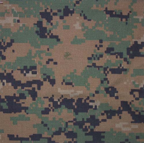
"Blob" M81 Woodland "Pixels" MARPAT

This may be the most well-know type of camo. It is inspired by natural cryptic coloration. The soldiers are not born with skins like those creatures in the woods, so we clothe them.

One very interesting fact is that the camo pattern in the US Marine uniform has become pixelated since 2003. The new pattern looks pretty trendy: it is formed by a number of small rectangular pixels of color. In theory, it is a far more effective camouflage than the traditional patterns because it mimics the dappled textures and rough boundaries found in natural settings. This is caused by how the human eye interacts with pixelated images. It is also known as the "digital pattern" because of its micropattern (pixels) rather than the old macropattern (big blobs).

To reach the final versions of MARPAT (MARine PATtern), the United States Marine Corps design team went through over 150 different camo patterns. The pixels were generated by highly complex fractal equations that result in a non-repeating pattern. Then they narrowed down to three and reconstructed them with new shapes and unique color blends that would allow a more effective uniform in a great range of environments. Before issuance, field tests were required in various environments, wet and dry, day and night, with night vision and various optics. (How do architects make patterns?)

The first pixelated camo pattern was introduced in 1997/98 on the helmet cover by the Canadian Forces. It's called CADPAT (CAnadian Disruptive PATtern).

The art of camouflage II - Conceal


Forgot when and where this was. But it was during some war, an aircraft factory was built and covered by fake grassland and a road, so the enemy fighter jets wouldn't see it.

Did "green roof" just become a trend recently?

The art of camouflage I - Dazzle


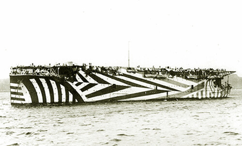
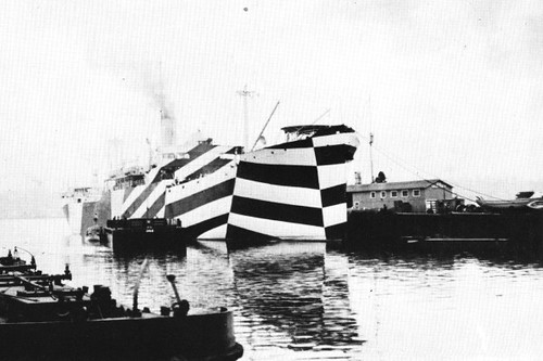
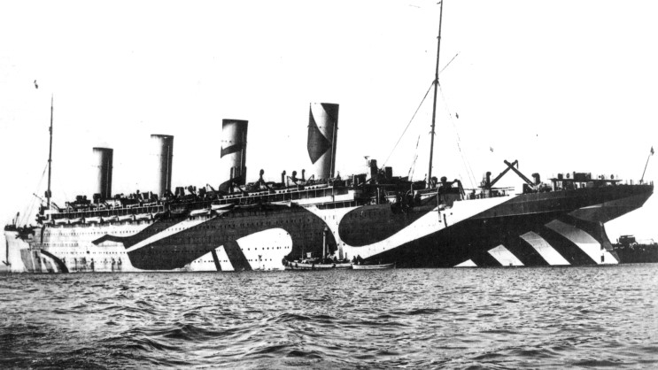
At first glance, this doesn't seem to be camouflage at all - the pattern draws attention to the ship rather than hiding it. But the dazzle technique was developed with the blessing of Gestalt Psychology in early 20th century and was widely adopted by many countries during WWI and WWII.

The purpose is to confuse rather than conceal. The bold clashing pattern disrupts the naval visual rangefinders and makes it difficult for the enemy to estimate the vessel's shape, speed, and heading.

Saturday, January 3, 2009

Fabulous ocean liners


Look at these ships - how fantastic! Varies types/sizes of program spaces are brilliantly fit into this shape engineered for optimal movements. How can OMA patent "cake-tin architecture" (as in TVCC) as an original idea? How can MVRDV claim their sections being innovative?
Look what's inside. They have everything you need for urban life. That's Archigram's "Walking City"!


SS Normandie