Thursday, April 23, 2009
Connections and separations
As shown in the new maps created by researchers at the European Commission's Joint Research Center in Ispra, Italy, and the World Bank, our world is pretty connected. You can get to the next city within 2 days from more than 90% of the land. (Not including Antarctica, I guess?)
This is a fantastic series of maps. But when I think of it, it's hard to forget in some occasions humanity does move away from connectivity. Politics, religion, economy... There are too many driving forces of separation...
Sunday, April 19, 2009
The new inflatable moment
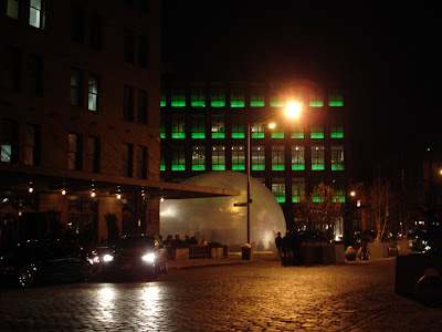
Maybe it's my obsession with the 60s, I found the Spacebuster truly intriguing. This mobile inflatable structure is a blown-up version of Archigram's Cushicle, or Suitaloon. But instead of being private/intimate, this big bubble designed by Raumlabor is public. Organized by Storefront for Art and Architecture, the Spacebuster will travel around New York City for 10 consecutive evenings for various events, such as lecture, screening, community workshop, and parties.
Tuesday, April 14, 2009
Trajectory of the Pritzker
The Pritzker Prize is awarded "irrespective of nationality, race, creed, or ideology." But I think it would be interesting to geo-code the recipients' offices and find out how the highest honor of architecture traveled around the world.
(Year Laureate, age at announcement Location of office)
1979 Philip Johnson, 72 New York, USA
1980 Luis Barragan, 78 Mexico City, Mexico
1981 James Stirling, 54 London, UK
1982 Kevin Roche, 60 Hamden, USA
1983 I. M. Pei, 66 New York, USA
1984 Richard Meier, 49 New York, USA
1985 Hans Hollein, 51 Vienna, Austria
1986 Gottfried Böhm, 66 Cologne, West Germany
1987 Kenzo Tange, 73 Tokyo, Japan
1988 Oscar Niemeyer, 80 Rio de Janeiro, Brazil
1988 Gordon Bunshaft, 78 New York, USA
1989 Frank Gehry, 60 Santa Monica, USA
1990 Aldo Rossi, 58 Milan, Italy
1991 Robert Venturi, 65 Philadelphia, USA
1992 Alvaro Siza, 58 Porto, Portugal
1993 Fumihiko Maki, 64 Tokyo, Japan
1994 Christian de Portzamparc, 50 Paris, France
1995 Tadao Ando, 53 Osaka, Japan
1996 Rafael Moneo, 58 Madrid, Spain
1997 Sverre Fehn, 72 Oslo, Norway
1998 Renzo Piano, 60 Genoa, Italy
1999 Norman Foster, 63 London, UK
2000 Rem Koolhaas, 56 Rotterdam, The Netherlands
2001 Jacques Herzog & Pierre de Meuron, 50 Basel, Switzerland
2002 Glenn Murcutt, 65 Sydney, Australia
2003 Jørn Utzon, 84 Haarby, Denmark
2004 Zaha Hadid, 53 London, UK
2005 Thom Mayne, 61 Santa Monica, USA
2006 Paulo Mendes da Rocha, 77 San Paulo, Brazil
2007 Richard Rogers, 73 London, UK
2008 Jean Nouvel, 62 Paris, France
2009 Peter Zumthor, 65 Haldenstein, Switzerland
Monday, April 13, 2009
Armani 5th Ave
Curiosity arose when I saw online the pretty images of the new Armani Store on 5th Ave designed by Fuksas. Look at that central stair - so fancy! So I decided to go and take a look.
The visit turned out to be an agony. It looks so bad!! I can't imagine how Giorgio Armani would accept the quality of construction, since perfection should be the motto of every fashion house. There's no craftsmanship whatsoever. All components are falling apart, with sometimes as wide as 2cm of plaster to join them. Nothing is cut precisely. No line of the supposedly smooth form is finished smoothly. You need a very high tolerance to even walk half way up without wanting to hit something.
There's not only construction problems. The design was obviously not done right either. The whole thing looks like the result of one lunch charrette. Nothing is worked out. The ribbons don't follow the slope of the steps, fine. But they need to meet properly. The landings are large and needs panelization, OK. But the seams should be somehow arranged with the geometry. There will be structure, absolutely! But it can't just be banging in and out. How hard is it to figure all that out with a precise Rhino model? All you need is just a little professionalism.
Maybe the most disturbing aspect though, is the missing criticism. The media is completely silent about its failures. Everybody is just sitting in their room and quote the press release. Some even ended up singing high praise base on the pretty photos they saw. I couldn't even find one close-up image on the web that shows the problems. So there you go!
Buzz of the others
Elizabeth Currid and Sarah Williams created maps of New York and Los Angeles in their study “The Geography of Buzz,” trying to find patterns that define how the creative art world works in the two cities. It sounds like a very interesting research, and I respect the hard work. But I really don't agree with their findings.
The first paragraph in a related New York Times article goes, "Apologies to residents of the Lower East Side; Williamsburg, Brooklyn; and other hipster-centric neighborhoods. You are not as cool as you think, at least according to a new study that seeks to measure what it calls 'the geography of buzz.'" What do "cool" and "hip" really mean? What's culture and what's art? The study collects events such as film and television screenings, concerts, fashion shows, gallery and theater openings. Creative art only happens where these events are held? Are all concerts and films cool and hip? The study found out that major "cultural milieus" in New York include Times Square, Carnegie Hall, and Lincoln Center. Who goes to Times Square for art? If a fashion show is held there, it is not because it's a locale where creative arts are buzzy, but just for the publicity of the place! I guess the hipsters couldn't even get into Lincoln Center or Carnegie Hall with what they are wearing, even if an opera would be considered as hip.
The two authors used a "unique data set," Getty Images, to find the events. What kind of events would catch the eyes of Getty Images? Given the fact that the photos are for sale, I'll say the agency would probably only consider the media-worthy ones. This is not only an incomprehensive set of data, but a biased one. Indie cool and hip events with no celebrity involvement would be most likely overlooked. This will eventually kill creativity if we let the dominating mainstream media act as a cultural gatekeeper. As Keith Haring said, "artists should be a kind of antagonists of their culture." Well, I think if Getty Images were operating in the 80s, they wouldn't care to take pictures when Keith Haring drew with white chalk in the New York subway stations anyways.
Tuesday, April 7, 2009
Jenny Holzer at Whitney
Words / Image
Some say language is Jenny Holzer's prime medium. Maybe I am not as sensitive to words; I actually found the image more prevailing. No matter what they say, the LED signs in different configurations create a dazzling scene inside Whitney. Colorful letters are blinking, zooming, scrolling, hitting the wall and disappear. In the immersive sea of direct and reflected light, words become the image. As Marshall McLuhan said, "the medium is the message."
But I did spend some time reading. It's interesting to see Holzer's narratives changing from her earlier poetic literature to the recent non-fictional subject matter. There's a series of paintings reproduced from war-related declassified documents such as testimonies, autopsy, interrogation reports, confessions, handprints, etc. Heavy redactions black out sensitive contents. Again, verbal reality becomes implicit but strong visual apparatus.
Time / Pace
Back to the scrolling LEDs. I think the most interesting aspect is the movement of the texts, especially when the signs are parallel. Most of the time they are synced to move in the same direction at the same pace. But it gets more appealing when they don't. Sometimes they start in succession, sometimes they move in the opposite directions, and sometimes texts of different font sizes slip past in double layers. The most interesting case I saw there though, was in "Red Yellow Looming" where texts scroll in a parallel configuration resembling a stairway. They are of different font sizes and moving in different speeds - the larger text moves faster than the smaller one in order to catch up. As a result, the pace of information feed remains the same.
Space / Depth
The configuration certainly defines space. And the use of double-sided LED signs creates a force field of reflected color light way beyond the actual shape. After staring at it for a while, you will feel the light flattening your view and dematerializing it into pure luminosity. When the letters hit the wall, the changing light on the wall gives you a sense of infinity. The only exception from parallelity is "Green Purple Cross" and "Blue Cross" which jointly claim the corner with 12 angled LED signs. When the texts moving from both sides collide, space starts to strangle...
Although the artist claims to have careful considerations about the shape, I found no apparent connection between the configuration and the content. Maybe that's OK. We've known this lack of signification long enough. We call it flexibility, or universality.
Monday, April 6, 2009
9% more productive
(Reuters) An Australian study showed that people who use the Internet for personal reasons at work are about 9 percent more productive that those who do not. Yes, more, not less!
Brent Coker from the Department of Management and Marketing studied 300 workers, 70 percent of them use the Internet at work for leisure browsing. He coined the term "workplace Internet leisure browsing," or WILB. Among the most popular WILB activities are searching for information about products, reading online news sites, playing online games and watching videos on YouTube. "People need to zone out for a bit to get back their concentration," Coker said. Occasionally checking out the web is like taking short and unobtrusive breaks. That "enables the mind to rest itself, leading to a higher total net concentration for a day's work, and as a result, increased productivity," he said.
It makes sense, I think. That's why schools are having 45-50 min class sessions and 10-15 min breaks between them. And the subject is changing every hour, or sometimes every other hour. But in the office, there are no official breaks. You are supposed to work continuously otherwise you'll be considered as a sneaky lazy sloth and eventually lose your job. Everybody is so afraid to even leave the seat and relax for a little bit...
Of course, the study looked at people who browsed in moderation, or were on the Internet for less than 20 percent of their total time in the office. "Those who behave with Internet addiction tendencies will have a lower productivity than those without," Coker said.
Wednesday, April 1, 2009
Teapot and architecture
In the documentary "Bird's Nest: Herzog & de Meuron in China," Jacques Herzog said, "Architecture is impotent in many ways, but it's there. It will still produce some impacts. This is like a teapot - it may change the taste of the tea. I think it's the same case in wine." Herzog is not the first one to compare a building to a vessel. Lao-Tzu wrote thousands of years ago in his Tao Te Ching: "Clay is molded to form a vessel; because there is emptiness inside, the vessel is useful. Doors and windows are cut to make a room; because there is emptiness inside, the house is livable. Thus, we take advantage of what is there, yet it is the Nothing that we use (Chap.11)." This quote is so well accepted in China that it appears in every single "Architecture 101" textbook.
To extend the metaphor, Herzog actually adds a new dimension, or even a twist to it. What Lao-Tzu intended to emphasize is the dichotomy of being and non-being. In his mind, being exists because we need the non-being. To Herzog, there is not only emptiness in the vessel. A vessel contains something. Emptiness will be filled when the vessel is in action. The existence of a teapot is not just passive - its shape, materiality, density, and kiln temperature all actively affect the quality of tea in it. For example, clay teapots are meant for use with black and oolong teas, while porcelain ones are better for teas with strong aroma (such as jasmine tea). A smaller and denser teapot could help keeping the complexity of the tea. In the case of architecture, it is also more than space. A building is a container with contents. When occupied, it houses various user activities, layered or juxtaposed. And these activities ultimately compose a lifestyle. Architecture affects behavior. A visionary architect is ultimately curating lifestyles through the design of the building.