Friday, October 30, 2009

R-O-B builds


A Swiss robot (named R-O-B) has finished building a brick wall on Pike Street, New York. According to Storefront, this is the first ever architecture project digitally fabricated on site. The design was developed through Gramazio & Kohler's research on architecture and digital fabrication (DFab), which was initially established at ETH Zurich, Faculty of Architecture in 2005.

Watching R-O-B in action is exciting -


The robot is mounted on a lowbed trailer. It slides along the construction site through the process.
It picks up a brick from the belt and puts on some glue...
then moves out...
and gently lays down the brick in the precise position.
The result is a 22m-long structure built from more than 7,000 bricks. The weaving form loops in and out in changing rhythms, lifting off the ground sometimes and intersecting with itself.
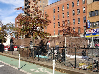
I don't want to sound dismissive of new technology, which is in fact fascinating. But at the same time, I also have some doubts:
- Integration of design and fabrication: We all more or less design digitally now. But the highly acclaimed digital designs often ended up as clumsy plaster works. (Need an example?) The marriage of design and construction is a big challenge. R-O-B certainly opens up a whole new array of possibilities. At least it's way cooler than the current BIM hype that made the ugly Yankee Stadium "Best Project of the Year in New York."
- Accuracy: If you want a complex geometry (yeah, if you really need it), it would be hard to make it manually. CNC processes can make sure the outcome is precisely what you want. But with this brick wall, is on-site digital fabrication really "the only way" it can be achieved? OK, perhaps I should accept the fact that patience and craftsmanship are long lost legends...
- Strength: The industrial robot unit is powerful. Lifting bricks? Why use an ox cleaver to kill a chicken?
- Speed: The whole process took 4 weeks. I am not sure how that compares to conventional brick wall builders.
- Labor: And we do need labor after all. Controlling the machine, feeding the belt with bricks, and taking care of the built part, at least three people were working on site. I am not talking about how many people were behind the scene programming and writing scripts. After the robot was done, they still need to remove some bricks at the bottom since the design asks for some suspended sections. I guess you just can't ignore the law of gravity when you lay brick walls.

When talking with Michael the project leader and Cesar the producer, I learned some making-of stories. DFab is actually quite done with brick now. They have built several brick walls since 2006 and have already moved on to many other materials and techniques such as structural wood, drilling holes in concrete, and spraying foam. However, for this project, the mobile robot unit was borrowed from one of the sponsors Keller AG Ziegeleien. It is a brick company so the material would be free too. Suddenly the answer to my doubts became clear. It's not that DFab hasn't fully recognized the great potential of R-O-B, but just everything comes down to power and money. It's the reality of getting things done. Most architects choose not to talk about it, and schools never taught that either. Students just sit in front of the computer and play with Grasshopper. Parametric design has neglected one very important parameter - money. Maybe we need a software that allows you to slide a "budget bar" and your model will automatically change form and material...

Tuesday, October 27, 2009

Think positively


There's a big difference between seeing problems and being negative. It depends on your reactions to the problems. When some people see problems, they start to get frustrated. They sigh; they yell; and they think they are doomed. Another kind of reaction, which I would include in the category of positive thinking, is to actively seek solutions and take actions that will make things better.

Being able to identify problems is a skill. The positive attitude behind it is the audacity of hope. The Chinese phrase "crisis" comprises two characters: danger and opportunity. Seeing danger, and more importantly seeing opportunities in danger, gives people the courage to face reality and survive the crises. In the field of design, there are numerous examples where constraints are turned into the source of innovation. If you have a hopeful and constructive mind, challenge can always have positive influence and sparkle a new kind of creativity. "What's against it works for it."

In my opinion, the truly negative people are those who fear to face, or even don't care to understand reality. They live in their own world, like ostriches burying their heads in sand, pretending there's no problem and the world is all beautiful. This sounds nothing optimistic to me. It is just naivety. It is full of self-indulgence and lacks care. Of course, it's important to always look on the bright side, but it doesn't mean we should ignore the existence of the dark side. When small problems are neglected, they could accumulate and become big ones. Then it may be too late for any solution. In fact, ostriches are better than that. They actually do not bury their heads in sand. When threatened, they run away. I guess it's at least an acknowledgment of reality and probably the only one effective and constructive solution. If you know you can't win, RUN!

Thursday, October 22, 2009

41 Cooper Square


I have to say I respect Thom Mayne because he was able to pull this off in a city like New York. I am not a big fan of Morphosis, but I think I like this building...

From the outside, it looks kind of bulky. But the metal skin gives it a nice texture. I am still not sure if the ground floor provides a good urban interface but the split of the screen is certainly successful in implying special (communal) happenings inside.


Entering the lobby... a grand stair leads the way directly up to the fourth floor, where a double height student lounge is located. I stared at the mesh/lattice in the atrium for quite a while and still couldn't figure out what it's there for. Certainly not structural. Maybe it's just there to hold the figure of the void together, and imply a dynamic gesture. Or maybe, it's just LA...

The stairs are my favorite part. The spiraling, overlapping geometry; the glowing guardrail; the offset handrail...

The stairs connect informal gathering spaces on different levels. At the top, the lattice seems to contract with a centripetal force and terminates at a skylight. This skylight is disappointingly small... After all the journey up the stairs, I expected a more interesting ending.

The perforated metal skin is another element I like in the building. The patches of "non-perforated" areas give subtle variations to an otherwise monotonous sun screen.

The sensibility of materiality is also exemplified in the auditorium, where the wrinkled metal mesh acts as acoustic panels.


Monday, October 19, 2009

Objectified


I missed the documentary "Objectified" when it was in theaters, so I ended up getting it from Netflix. It's actually better because I can watch it over and over again and write down the quotes I like. (Spoilers Alert!)

On form and function

Alice Rawsthorn, design editor of International Herald Tribune, comments on the new generation of products where "the form bears absolutely no relation to the function." "Look at something like an iPhone and think of all the things it does. In 'ye olden days' of what are called analog products, ... something like a chair or a spoon, 'form follows function' tended to work." Imagine some Martians land on Planet Earth, they could get a rough sense what they were supposed to do with them, by the shape of the object, by the way it looks. "Now all that has been annihilated by the microchip. So design is moving from this culture of the tangible and the material to an increasingly intangible and immaterial culture."

Karim Rashid talks about the camera. Before the digital age, the silver film defines the format and proportion of cameras. "All of a sudden our cameras have no film, why on earth do we have the same shape we had before?"

On design thinking

Design is not about the average person. Dan Formosa from Smart Design New York says, "What we really need to do to design, is to look at the extremes, the weakest, or the person with arthritis, or the athlete, the strongest or the fastest person. Because if we understand what the extremes are, the middle will take care of itself." If people with arthritis can hold on to a handle comfortably, it will work for everybody.

David Kelley recalls when he started the design consulting firm IDEO, industrial design was "primarily about aesthetics, or the cleverness around function." Designers were like "hired guns to complete some aspect." As they grew they became more and more involved in the design of the overall product. When they take a more user-centered consideration of "what do people value, what are their needs?" it results in different products, or sometimes it's not necessarily a product, not an object per se. The real question becomes not "What's a new toothbrush?" but "What's the future of oral care?" Design thinking is a way to systematically be innovative, to design creative scenarios that are based on objects.

On bad and good design

David Kelley: "People need to demand that design performs for them and is special in their lives. If you can't make your GPS thing work in your car, there should be like a riot because they are so poorly designed. Instead the person sits there and thinks, 'Oh I am not very smart, I can't make this GPS thing work.'"

Karim Rashid: You feel it when you sit in chairs that are very uncomfortable. Imagine how many chairs have been done to date in the world, "why on earth should we have an uncomfortable chair? There's no excuse whatsoever."

What's good design? Dieter Rams, German designer and former design director at Braun, gives the following ten principles:
"Good design should be innovative.
Good design should make a product useful.
Good design is aesthetic design.
Good design will make a product understandable.
Good design is honest.
Good design is unobtrusive.
Good design is long-lived.
Good design is consistent in every detail.
Good design is environmental friendly.
Last but not least, good design is as little design as possible."

It's interesting to see how many designers featured in the film agree that good design objects are straight-forward. Henry Ford once said, "every object tells a story, if you know how to read it." Japanese designer Naoto Fukasawa describes it as "design dissolving in behavior." This reminds me of the Daoist concept of "Wu Wei," which literally means "not doing anything" but implies letting it act naturally.

Jonathan Ive, Senior VP Indutrial Design of Apple, explains the design of the MacBook Air. "A lot of what we seem to be doing in a product like that is getting design out of the way. And I think when forms develop with that sort of reason, and they're not just arbitrary shapes, it feels almost inevitable, it feels almost un-designed. It feels almost like, well of course it's that way, why would it be any other way?" They tried to remove the things that are "all vying for you attention." It should "speak about how you are gonna use it, not the terrible struggles."

Alice Rawsthorn says, "Many of the best examples of industrial design are things that people don't think were designed at all." People just use them so comfortably that they just take it for granted. Yes, people tend to only notice and yell when things break or get stuck...

I am saving my favorite for the last. Dieter Rams again: "What particularly bothers me today is the arbitrariness and thoughtlessness, with which many things are produced and brought to market. Not only in the sector of consumer goods, but also in architecture, in advertising. We have too many unnecessary things everywhere." Nicely put! I am going to shave.

Friday, October 9, 2009

The pursuit of happiness


Blaise Pascal once said, "All men seek happiness. This is without exception." Happiness is one of the inalienable rights, but designers/architects don't seem to consider it necessary. They rarely smile in their portraits. Instead, they try to act serious to appear "cool." At a Columbia lecture last night, graphic designer Stefan Sagmeister laughed at this and said, "Cool is just a stupid way of being."

In order to remain refreshed and happy, Sagmeister takes one-year sabbaticals every 7 years. (He just recently came back from one in Bali.) He did a little math: average Americans learn in the first 25 years of their life, then work for 40 years and retire at the age of 65. Why don't we use five of the retirement years and disperse them as intervals into those working years? For him, it's a good way to avoid repeating old ideas. And economically it's actually beneficial since you can raise the fees if you have good and fresh ideas all the time.

There are at least two ways of finding happiness in design. One can be happy experiencing design. For design objects, he talked about the moment of happiness in the 1980s when he rode a Yamaha motorcycle and listened to The Police's Synchronicity on a new Sony Walkman. As art works, James Turrell's room at PS1 in New York, Ji Lee's speech bubbles project, and Anish Kapoor's Cloud Gate in Chicago were used as examples that had made him happy.

You can also be happy designing. In the pursuit of happiness in design, he suggests to "think what you really like to do before doing it." Here's a list of things that he likes about his job:
1. Thinking about ideas and content freely - with the deadline far away.
(No pressure is always better.)
2. Working without interruption on a single project.
(Concentrate without being frazzled. Immerse yourself.)

3. Using a wide variety of tools and techniques.
(Try not to get stuck or repeat yourself.)
4. Traveling to new places.

(Just go out and see new things, even if it's just a few blocks away.)
5. Working on projects that matter to me.
(Care more if it's important for you.)
6. Having things come back from the printer done well.
(Enjoy the end results.)

To describe the right to happiness as "I just want to do what I like" sounds like an excuse to be egoistic and stubborn. But happiness is your own pleasure and satisfaction, and is ultimately about fulfillment of the self. Right, maybe I should consider my own feelings more and treat myself better...

For the record, here are my favorite things from the lecture:

Favorite design: trophies for the Vilcek Awards.


Favorite story: When designing the logo for Casa da Musica, Sagmeister failed to avoid using the shape of the building. It was mostly because after Rem's presentation he realized architectural design is actually logo making. But he did avoid sameness by adapting the color palette with a computer program.


Favorite claim: "If a building can stand there for hundreds of years, it's a pretty damn sustainable building!"

Favorite of all favorites: laughing yoga.

Thursday, October 8, 2009

Barcode's birthday


Inspired by Google, this is my version to celebrate the 57th anniversary of the first barcode patent.


On October 7, 1952, US Patent 2,612,994 was issued to Norman Woodland and Bernard Silver for "Classifying Apparatus and Method," in which they described both the linear and bullseye printing patterns, as well as the mechanical and electronic systems needed to read the code. After decades of developments at IBM (a team led by Woodland), the UPC barcode - laser scanner partnership made its first commercial appearance on June 26, 1974 at Marsh's Supermarket in Troy, Ohio, when a 10-pack Wrigley's Juicy Fruit gum was scanned at 8:01 am.

According to a report by Motorola, more than 10 billion barcodes are scanned everyday now in 25 industries and in places including airports, hospitals, and shipping centers. It costs about $0.005 to implement a barcode. But the system ultimately resulted in significant economic and productivity gains for shoppers, retailers and manufacturers, with estimated cost savings of $17 billion in the grocery sector alone (according to GS1 US).

Wednesday, October 7, 2009

Architectural evolution


Bjarke Ingels made his way to the
TED talk stage. I am not going to comment on his Danish accent nor the cynical comments on China. What I would like to do is to pick up his idea of evolution and expend that a bit more.
Bjarke said, “rather than revolution, we are much more interested in evolution, the idea that things gradually evolve by adapting and improvising to the changes of the world... “ He used Darwin's evolutionary tree to describe how they work. "A project evolves through a series of generations of design meetings. In each meeting there are way too many ideas, only the best ones can survive." If the process of architectural design is really analogous to evolution, there are several questions need to be asked.

1. Who makes the selection?
In Darwin's theory, the key mechanism of evolution is natural selection. Mother nature has the power of picking fit species. Who has the power of picking options at design meetings? Our mighty boss - BI in the case of BIG, I bet. This is the inevitable ugly truth, the underlying relationship of employment. Any democratic process still needs a "chief commander" who has the veto power. Some may say, the bosses could base their selections on certain objective criteria. But architecture is not math. You can’t even define a functional kitchen with pure rational reasoning. Judgment is never an equation built with just objective standards. “Survival of the fittest” is hence a myth that varies from office to office. Program, aesthetics, economy, ecology… At the end, evolution in architecture is artificial selection.

2. How are mutants produce?
Mutation is accepted by biologists as the mechanism by which natural selection acts - "favorable" mutations may accumulate and result in adaptive evolutionary changes. There may be harmful mutations, but the encouragement of mutation in general at least increases the chance of beneficial ones. If we see everything unfamiliar as a freak, we can’t possibly make any progress. Mutation occurs in response to the external changes. For architects, a good and adaptive knowledge of the changing world in general enhances the fitness of their creative solutions. You have to be sensitive enough to react, right?

3. What nurtures biodiversity?
Biodiversity is often a measurement of the health of an ecosystem. The variation of species ultimately comes down to the variation of habitats. In an architectural office, only the atmosphere of open-mindedness can encourage diverse free thoughts. What could be the aggressive exotic species that destroys the balance here? I’ll leave that open for imagination…

Urban permeability


The streets system in Beijing is annoying. The megablock urban form means fewer streets and less permeability. All the fences have made the situation even worse. The authority’s hope was, when the streets are fenced up and organized with roundabouts, traffic is channelized – every direction of traffic flow has its own designated lane. As a result, there’s no cross traffic at intersections and the cars would never need to stop.

New York (left) and Beijing at the same scale

Beijing Dongzhimen: How am I supposed to cross the street?

Unfortunately, the planners overlooked the impact of travel time and the number of cars on the street. With the channelized streets, you’ll be miserable if you got into a wrong lane. It will mean you have to go to the next big roundabout and make a U-turn or go around a super-scale megablock just to get back to where you were. Even you are right, most of the time you still need to turn right and right and right again to make a left turn, or make a U-turn at the next intersection and come back and turn right. Still following? Yes, it’s that confusing. All this pain increases the duration of the trip, i.e. keeps the cars longer on the street. Who complains about too many cars on the street? Just let them get to their destinations easier and faster!