Saturday, July 28, 2012
The Olympic message
“Who will light the Olympic cauldron?” is a question that draws much speculation every four years. This time in London, people have compiled a list: would it be David Beckham? Daley Thompson? Bradley Wiggins? Tom Daley? The Queen? Prince William? Or even Pippa Middleton?
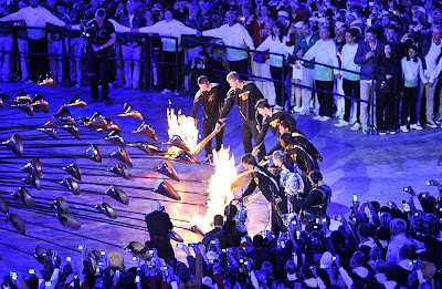
Finally, at the opening ceremony last night, seven young athletes lit the cauldron. They are “nobody” compared to the all-star guess list. But they represent hope of the future, potentials of something big. This choice reminds us of one of the key virtues of humanity: always look forward with hope. It’s not about what you have done, or what you are doing. It’s what you will do.
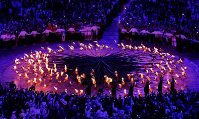
204 copper petals slowly rose and came together to form a large cauldron. These flickering flames symbolized 204 participating nations and regions, peacefully united as one. Our world is quite a mess right now. This cauldron lighting was like a fresh breeze, made me feel hopeful that we would witness the best of humanity in the weeks to come. Once again, Thomas Heatherwick managed to wow the world with a great British design. (Last time was of course at the Shanghai Expo.) A model of this cauldron will be added to Heatherwick’s exhibition at the V&A after the opening ceremony. (Should I go see it again?)
The rest of the opening was a big party with an overdose of British music, plus unique British wit and humor. Compared to Beijing, this was not as spectacular. But it felt more relevant. It's an Olympic of the common people, an Olympic of the moment, embracing a society of grassroots in the digital age. It will certainly “inspire a generation.”
Thursday, July 26, 2012
VSBA and LVMH
Earlier this week, Robert Venturi announced his retirement. The Philly-based practice he co-founded with Denise Scott Brown is rebranding as VSBA, under the direction of a new generation of leaders. This new abbreviated name sounds a lot like those big corporate firms such as SOM, KPF, and HOK – honoring the founders yet dissociating from their individual authorship. The question is: will the legacy of the founders survive in their absence?
 |
| Franklin Court: The house is absent. |
I’ve been debating with myself for quite a while now whether a design studio could continue if the head talent(s) were not there any more. I tend to say “No.” If the work of an office relies heavily on one or two particular “genius(es)” and his/her/their own sense of aesthetic and feelings, it is not sustainable. Taste and instincts are highly personal. It’s not teachable, not transferable. When the person goes, the sensibility goes as well. A more sustainable way (or at least relatively speaking) could be to nurture a method or a rigorous way of thinking and design. Offices that claim to operate on collective decisions always need to reason with hyper-rationality. But it gets boring easily, or sometimes even soulless. I guess that’s why spring-offs from You-Know-Who usually turn out stronger at the beginning than those from other offices, but they also wear out sooner.
Perhaps the only way to continue a name is to really make it a brand. Turn it into a hollow label detached from any individual, like SOM, KPF, HOK, or even Prada, Dior, Gucci, Louis Vuitton… It’s interesting to compare to fashion houses. Through generations of creative directors, fashion brands are less and less about the personal visions of Mario Prada, Christian Dior, Guccio Gucci, or Louis Vuitton. Consistency or identity (here I don’t used the word “style”) is no longer the highest concern of the companies. When LV took Moët et Chandon and Hennessy and formed a giant luxury goods conglomerate LVMH in 1987, it turned its identity from design to luxury consumerism.
When the brand transcends design, identity is easy to maintain. The value of LV bags is more about the logo printed on them than the actual aesthetic or functionality of the product. Another big difference between architecture and fashion is that fashion commodities (not haute couture) are highly repetitive. If you’ve got the iconic little black jacket, or the perfect formula of No.5, you just keep producing them and you’ll always be Chanel. We architects can’t build the same buildings over and over again, even if you are Frank Gehry or Zaha Hadid (they are pretty close though).
 |
| Chanel’s Little Black Jacket exhibition in New York |
Monday, July 16, 2012
Day trip to Dornach
Much has been said about Rudolf Steiner and his anthroposophical work. Last weekend I finally made a field trip to Dornach. Steiner’s peculiar style populated the whole area with his own creations as well as the ones by his followers. I felt myself being in a parallel universe with all the mystery and fantasy.
 |
| The Goetheanum and its surroundings |
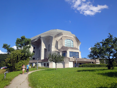
The Goetheanum is a badass monster. It sits on top of a rising slope like a crouching sphinx, or a metamorphic grotesque. This massive reinforced concrete construction is the replacement of a former wooden structure destroyed by fire on New Year's Eve 1922/23. The current building was built between 1925-28 on the basis of a model made by Steiner, and constant developments (including most of the interior work) were undertaken over the 70 years after its opening in 1928.
 |
| West entrance |
 |
| Door handles of the ground floor auditorium |
 |
| Handrail detail of the west staircase |
My favorite part of the building is the west staircase. Here, you see dramatic forms that are results of both structure and expression. The rough concrete texture reveals traces of board formed construction. I have to say, my jaw dropped when I came to realize they were doing all this fascinating stuff in the 1920s!
 |
| West staircase |
 |
| The red window |
The center of the building is the main auditorium with 1,000 seats. The interior we see today was not finished until 1998, developed by sculptor/painter Christian Hitsch and architect Ulrich Oelssner with concept and principles of the auditorium in the first Goetheanum. It is everything fantasy. The shotcrete (sprayed concrete) walls and pillars in seven metamorphosis sculptural forms, the richly painted ceiling that shows motifs of human evolution from the creation through the different cultural periods to the present day, the dramatic lighting and the colored glass windows that represent the rise of the individual to higher knowledge… (They call these the “three motifs of development”: cosmic evolution, development of humanity, and individual development.)
 |
| The elm wood doors to the main auditorium |
 |
| Main auditorium |
 |
| The main stage |
 |
| Staircase in the South Wing |
 |
| South stairwell with gradient colors |
 |
| Wood sculpture “The Representation of Man” on the fifth floor of the South Wing |
Around the Goetheanum there are also many smaller buildings designed by Steiner. The boiler house was built in 1915 with the first Goetheanum as the first concrete building on the site. The chimney is supposed to resemble a rising flame. But with the double cupolas, it looks like something else! What were people smoking back in the days?
 |
| The boiler house |
The transformer house is located at an intersection downhill. It’s a small structure with interesting shapes. Oh, are those stacked gable roofs? You thought our boys were innovative.
 |
| The transformer house |
Sunday, July 15, 2012
Scoping in Scope
Once again, I found myself enjoying the smaller shows parallel to Art Basel, especially the Scope show in Karserne. The participants here were no big-shot galleries and artists. But it was still interesting to see David Middlebrook’s appropriation of Magritte and Duchamp, Ellen Urselmann’s cute blown glass objects, Ralf Kaspers’ cloud-swimming people, and Kyoeng Sub Yue’s super nice paper cut-out with uncanny details – just to name a few. Traditional paintings usually don’t get my attention easily. But Italian artist Troilo’s powerful image painted by fingers was truly impressive.
 |
| David Middlebrook, Congress (front), Breath of Fresh Air (back) |
 |
| Ellen Urselmann, No Title, 2009 |
 |
| Ellen Urselmann, No Title, 2011 |
 |
| Ralf Kaspers, Summerland III Tokyo, 2011 |
 |
| Kyoeng Sub Yue, Cut Out |
 |
| Patrick Tschudi, Chinese Faith, 2012 |
 |
| Troilo, Untitled, 2012 |
 |
| Alexandre and John Gailla, No One Gets Hurt, 2012 (front), Chrysalide 12 (back) |
 |
| Bome, Oni-Musume, 2009 |
 |
| Kathy Mueller-Moser, Friends |
 |
| Idán Zareski, Big Foot, 2011 |
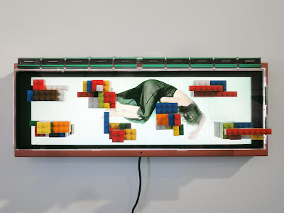
Compared to Art Basel, I felt I saw more fresh ideas and new media here in Scope. MARCK’s video installations synthesized film and physical objects into a new art form. Anna Tas used lenticular printing techniques to create a cute 3D version of Magritte. Alessandro Brighetti demonstrated electromagnetic manipulation of oil-based ferrofluids on a dark skull. Kenji Sugiyama created fascinating mini universes within pasta boxes. This series of dioramas explored the notions of consumerism and voyeurism.
 |
| MARCK, New Freedom (Bath II) Silver, 2011 |
 |
| MARCK, Mutterglück LEGO II, 2012 |
 |
| Anna Tas, Son of Man |
 |
| Alessandro Brighetti, Schizophrenia |
 |
| Kenji Sugiyama, Institute of Intimate Museums |
The most impressive was Claire Shegog’s Busby series. Inspired by Busby Berkeley’s films and choreographic work, Shegog painstakingly handmade thousands of miniature figures with matching costume and accessories, and arranged them in circular forms. The result was dazzling. Here we saw order and repetition, patterns created with attention to details in both design and craftsmanship.
 |
| Claire Shegog, Busby series |
 |
| Claire Shegog, Busby’s Chandelier, 2012 |
 |
| Claire Shegog, Busby’s Folly (left), Busby’s Showgirls (right), 2012 |
At Scope, I also saw more critical concepts behind the artworks. Satch Hoyt’s award-winning installation was a podium made from art books both found and donated from around the world. Who has the right to speech? This piece served as a critique on the contemporary art world, commemorating those who are not yet enshrined in the “legitimate” history of art. Deborah Sengl’s graphic installation reminded us of the pretentiousness in our culture, which completely gave way to consumerism, as Yves Marchand & Romain Meffre revealed in their photographic work. Even the ¥€$ regime is facing crises and paper bank notes themselves could be dispensable. Political corruptions? Jiao Xingtao’s marble sculpture was a critique of Bo Xilai’s extravaganza in Dalian. (He built a huabiao – traditional ornamental column – in Dalian that was twice as big as the ones in Tian’anmen Square.) Maybe we are better off living through special pills of hugs and love, as Edie Nadelhaft suggested. Or we could stand up to things, like what Ruby Anemic put in a neon sign: No Guts No Glory.
 |
| Satch Hoyt, Say It Loud: Recreating the Canon, 2012 |
 |
| Deborah Sengl, And Cut!, 2012 |
 |
| Yves Marchand & Romain Meffre, Gotham Theater, above and below. New York, NY, USA, 2009 |
 |
| Zevs, Liquidated Yes, 2011 |
 |
| Paul Rousso, Big Money |
 |
| Edie Nadelhaft, Better Living Thru Chemistry, 2012 |
 |
| Edie Nadelhaft, Chill, 2012 |
 |
| Jiao Xingtao, White Marble, 2010 |
 |
| Ruby Anemic, No Guts No Glory, 2012 |


