Sunday, August 26, 2012
Thursday, August 16, 2012
Polarity in Hirst
I used to think Damien Hirst is just the guy who puts dead animals in formaldehyde and paints color dots. Then at Art Basel and now the retrospective at Tate Modern, I experience the power of his sensational work. The Tate Modern exhibition gives me an opportunity to trace the development of the prominent British artist and see his body of work systematically through various viewpoints.
Life and death
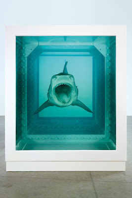
The first piece in the first room is a striking portrait of a young Hirst with a dead head. It’s based on a snapshot taken by a friend in the anatomy department at Leeds University when the 16-year-old Hirst went as a young student to make anatomical drawings. “I was absolutely terrified,” he later recalled. But he was laughing. Suddenly it all makes sense. Hirst’s fascination of death was there with him all along. He always claimed that his work is more about life. But death is essentially part of life. This polarized duality becomes one of the main themes in his career. When he put the shark in formaldehyde, he made it look threatening but helpless, powerful and weak at the same time.
 |
| With Dead Head, 1991 |
 |
| The Physical Impossibility of Death in the Mind of Someone Living, 1991 |
Life and death are oppositions, but they are also a cycle. The most power piece that addresses this concept is A Thousand Years. In an enclosed glass vitrine, maggots hatch inside a white box, turn into flies and feed on a bloody severed cow’s head lying on the floor. Flies circle around in the vitrine. Some hit the insect-o-cutor and die, others survive and continue the cycle. Here, the glass vitrine bears a clean and minimal geometry, while messy life and death of organic matter is contained inside, creating a literal enactment of birth, death, and decay.
 |
| A Thousand Years, 1990 |
In the two-part installation In and Out of Love, one room with a specially maintained humid environment contains white canvas where butterflies hatch and feed on sugar water and plants. Live butterflies fly around freely, and occasionally land on the visitors’ heads and shoulders. The other room shows eight colored monochrome canvases with dead butterflies randomly attached to their surfaces, like they have hit and died on it. In the center of this second room is a table with ashtrays full of cigarette butts. Here, the rooms are like vitrines. Again, the theme of life and death cycle is vividly shown.
 |
| In and Out of Love (White Paintings and Live Butterflies), 1991 – Room 1 |
 |
| In and Out of Love (White Paintings and Live Butterflies), 1991 – Room 2 |
Flies and butterflies make another interesting polarity pair. They represent beauty and horror, good and evil. Black Sun looks like, at first glance, a black monochrome painting. It takes me a while to realize it’s actually a surface densely covered in nasty dead flies. It creates a stark contrast to the almost holy butterfly paintings. While butterflies represent resurrection, flies convey more negative associations of death and decay.
 |
| Black Sun, 2004 |
 |
| Sympathy in White Major – Absolution II, 2006 |
Lethality and glamour
Cigarette is a repeated motif in Hirst’s work. It’s the contrast between an unsmoked perfect cylinder and the provocation of disgust after it’s smoked and discarded that appeals Hirst. What’s more fascinating for Hirst is the fact that something so lethal has been glamourized by seductive imagery in the advertising industry for decades. Hirst gathers the contents of hundreds of ashtrays and intensify the reaction of disgust (visually and olfactorily), or presents cigarette butts lined along the shelves of a cabinet like a natural history exhibit. These pieces can be seen as contemporary memento mori. A reminder of the inevitability of death.
 |
| Crematorium, 1996 |
 |
| The Abyss, 2008 |
Structure and randomness
Hirst has created numerous paintings with spots varying from minute to monumental in size, and from half a spot to thousands in number. Typically, the spots are in a grid, all of the same size with the gaps between the spots the same size as the spots themselves. Going hand-in-hand with this hyper-rigid set of parameters is a seemingly random arrangement of colors. In fact, no single color is ever repeated in one painting. This consistent structure actually started in 1986 with a random arrangement of spots, a piece also included in the retrospective.
 |
| Arg-Glu, 1994 |
 |
| Spot Painting, 1986 |
The first animals that Hirst encased in formaldehyde were fish. In this piece he separates the items and arranges them on shelves in two cabinets: one with fish “swimming” left and the other to the right. It’s “for the purpose of understanding” only. But in reality, they are not so structured in nature.
 |
| Isolated Elements Swimming in the Same Direction for the Purpose of Understanding (Right), 1991 |
Religion and science
Butterflies’ connotation of resurrection brings Hirst’s elaborate butterfly paintings a special religious overtone. Many of them are arranged into complex patterns that resemble traditional stained glass church windows. On the other hand, Hirst extends his explorations of science in art. He makes cabinets filled with medicine or surgical instruments. There is also a blown up anatomical model standing outside at the plaza in front of Tate.
 |
| Doorways to the Kingdom of Heaven, 2007 |
 |
| Hymm, 1999-2005 |
The polarity of religious and scientific themes are best combined in The Anatomy of an Angel. The beautifully carved white marble statue looks perfectly graceful from one angle, while the other side reveals bones, muscles, and a section of internal organs.
 |
| The Anatomy of an Angel, 2008 |
Pharmacy is a whole-room installation. Here the extensive clinical order of the cabinets filled with medicine packaging suggests the dominating power of modern medicine. But the fact that this is in an gallery where art and science have the same visual language sounds intriguing. “It would be great we can get people to believe in art the same way they believe in medicine,” Hirst once said. There are also four glass bottles with mysterious colored liquids. They represent the four elements found in old apothecaries: earth, air, fire, and water. The insect-o-cutor hanging in the middle is to “make a comparison of people being like flies” (referring to A Thousand Years). “You can only cure people for so long and then they’re going to die anyway.”
 |
| Pharmacy, 1992 |
I have come to realize what is so fascinating about Damien Hirst’s work is the profound synergy of polarized notions that marries beauty and horror: life and death, lethality and glamour, structure and randomness, religious and science, flies and butterflies, good and evil, black and white. His Francis Bacon-like intensity, angst, dread, and passion have made him a prominent icon of his generation, and rocked me deeply inside.
Tuesday, August 14, 2012
The new dungeon of London
The Tanks at Tate Modern in London opened to the public last month. Three old oil tanks of the former power station have been transformed into new spaces dedicated to installation, video, and performance pieces. These concrete cylinders are not visible from the outside, accessed only via underground connection from the Turbine Hall.
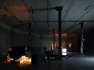
It’s pretty dark inside. You feel an atmosphere unlike a white cube gallery, nor a black box theater. It’s more like a secret dungeon where any crazy sh*t can happen – a perfect cool place for experimental art. I am not sure about the choice of Sung Hwan Kim, who has divided one tank into rooms for different videos. But the other tank that is left empty for performance programs reveals the full dimension: 30 meters in diameter and 7 meters in height.
 |
| Remember that joke about revision clouds? |
The Tanks are the first stage of the Tate Modern extension project by Herzog & de Meuron. Here, the architects’ intervention is quite subtle. Instead of fixing it up to a posh gallery with white walls and wooden floors, they decided to just leave it in its raw industrial status with rough concrete texture. They also let the massive voids speak for themselves – there’s no need to dramatize what’s already impressive.
In an interview with Sonntags Zeitung, Jacques Herzog said, “We have avoided the dialectics of old and new, as preferred by many architects from Modernism up to today.” This is an important conceptual shift. It’s so easy to put a sleek glass skylight or entrance and make it a distinct feature in the new romantic galleries. But HdM resisted the temptation. They chose to think about what was already there before forcing anything new. This approach matches the philosophy behind their Serpentine pavilion this year, just in this case they work with more physical existence, not only ghosts. They have cleaned the dirty parts, patched up the damaged parts, and the only new element is probably the diagonal concrete columns that support the extended galleries above. The result is a continuation, or even reinforcement of history; a composition of the present and the past, where the junction of the two become blurry and uncertain.
Outside in the Turbine Hall, Tino Sehgal is the star of this year’s edition of Unilever Series. The massive Turbine Hall is turned into a stage for Sehgal’s crew, who are walking, running, humming, chanting, singing, and telling stories all over the place. Lighting in the space has also been coordinated with the loosely choreographed performance. This simple but brilliant live piece brings in very special energies, interacting closely with the visitors. Strangely, it reminds me of the Occupy movement. It also reminds me that happiness does not necessarily rely on materialism. I am glad to see the intangible form of art, as the Tanks are promoting, has gained more recognition in the recent years.
Saturday, August 11, 2012
The ghost of Eisenman
Herzog & de Meuron and Ai Weiwei have created the 12th edition of the Serpentine pavilion. The collaboration sounds a bit stretching the Serpentine rules. But the fact that Herzog and de Meuron actually worked with Ai Weiwei after he was detained is a much stronger statement than just words.
The pit
So much had been done on Serpentine’s lawn in the previous years. HdM+AWW’s first instinct was to go underground as an attempt to “sidestep the unavoidable problem of creating an object, a concrete shape.” They didn’t want an object, but they still need form. The solution was to get it from what had been there before: the traces of the previous pavilions. Overlap the footprints and foundation geometries, and a distinctive pattern was found. The official description says, “Taking an archaeological approach, the architects have created a design that will inspire visitors to look beneath the surface of the park as well as back in time across the ghosts of the earlier structures.”
The design didn’t remind me of the previous pavilions, but rather Peter Eisenman’s 1978 project for the Cannaregio district of Venice. It was the first of Eisenman’s “Cities of Artificial Excavation” series where he described the projects as “the outcome of a history ‘given to’ the building.” HdM+AWW’s “archaeological excavation” to let the landscape “emerge by itself” echoes the Eisenmanian claim of “I didn’t design it.”
But just like Eisenman’s Cannaregio, the architect’s hand is still evident in the Serpentine pavilion. First it’s the superimposed 2D lines. The lines only exist virtually. You have to decide which traces to select for the final design. Contrary to the claimed straightforwardness, this process is quite personal, if not arbitrary. Then there’s the 3D interpretation of the “reconstructed” 2D pattern. The outlines of the different shapes do not necessarily suggest contours. The level changes were completely invented. But I guess if you get a beautiful thing at the end, it doesn’t matter whether you call it an “object” or not. Autonomous or not, it’s a good excuse for a formal exercise anyways.
 |
| The generation of the pit landscape |
 |
| Peter Eisenman, Cannaregio project in Venice |
The pit is covered with cork for its tactile qualities, and also its earth-like color and scent. It creates a warm and soft surface for people to hang out – sitting, chatting, or playing with their kids and pets. When I visited, the color of the cork was already fading, especially in the area under more sun exposure. This reminded me of the water stain on the wall of the Rémy Zaugg studio – a manifestation of time through the effects of nature. In this case, it’s the character of the ephemeral.
The circle
The pit needs a cover. In order to stay true to the “non-object” concept, the design team set out to look for a “non-shape.” The final decision was a circle because the designers believe that platonic shapes are universal, which means they are essentially neutral. It’s intellectually intriguing. But in reality, a floating round disc is quite a strong gesture in the park, even more so than Eisenman’s grids.
I can’t quite comprehend HdM’s recent obsession with circles. Maybe it’s like that German saying: “When an architect doesn’t know what to do, he draws a circle.” In fact, the Serpentine Pavilion marks the first built work of HdM’s circle era.
The floating disc is shifted to create an entrance area on the side. I found that people tend to gather along this edge simply because a sunny weekend is quite precious in London.
 |
| Traces of previous pavilions, cork landscape, and cut circular water mirror |
The cut
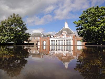
There’s a thin sheet of water on top of the circular cover. You can see it under eye level from the higher side in the back. HdM+AWW have grafted a lake into the park, doubling the surrounding green trees and the blue sky. It becomes an integral part of the whole landscape. When I visited, the pool had turned quite red because of oxidation. Again, I didn’t mind so much since it’s only natural and the transformation reflects the temporary nature of the pavilion.
On the side facing the Serpentine Gallery building, there’s a cut on the circle. I had been skeptical about it because I thought it looks like a mistake in an otherwise perfect circle. But when experienced it in person, I realized that it actually made the pavilion more respectful to the adjacent structure. Contrary to Eisenman’s self-referential autonomy, HdM+AWW seek co-existence with landscape and the neighbors. Jacques always talks about specificity, and this is a perfect example along that line of thought. How to make a generic circle more specific? Make a cut parallel to the next building.


