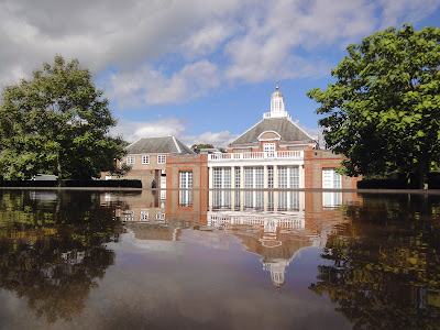
Herzog & de Meuron and Ai Weiwei have created the 12th edition of the Serpentine pavilion. The collaboration sounds a bit stretching the Serpentine rules. But the fact that Herzog and de Meuron actually worked with Ai Weiwei after he was detained is a much stronger statement than just words.
The pit
So much had been done on Serpentine’s lawn in the previous years. HdM+AWW’s first instinct was to go underground as an attempt to “sidestep the unavoidable problem of creating an object, a concrete shape.” They didn’t want an object, but they still need form. The solution was to get it from what had been there before: the traces of the previous pavilions. Overlap the footprints and foundation geometries, and a distinctive pattern was found. The official description says, “Taking an archaeological approach, the architects have created a design that will inspire visitors to look beneath the surface of the park as well as back in time across the ghosts of the earlier structures.”
The design didn’t remind me of the previous pavilions, but rather Peter Eisenman’s 1978 project for the Cannaregio district of Venice. It was the first of Eisenman’s “Cities of Artificial Excavation” series where he described the projects as “the outcome of a history ‘given to’ the building.” HdM+AWW’s “archaeological excavation” to let the landscape “emerge by itself” echoes the Eisenmanian claim of “I didn’t design it.”
But just like Eisenman’s Cannaregio, the architect’s hand is still evident in the Serpentine pavilion. First it’s the superimposed 2D lines. The lines only exist virtually. You have to decide which traces to select for the final design. Contrary to the claimed straightforwardness, this process is quite personal, if not arbitrary. Then there’s the 3D interpretation of the “reconstructed” 2D pattern. The outlines of the different shapes do not necessarily suggest contours. The level changes were completely invented. But I guess if you get a beautiful thing at the end, it doesn’t matter whether you call it an “object” or not. Autonomous or not, it’s a good excuse for a formal exercise anyways.
 |
| The generation of the pit landscape |
 |
| Peter Eisenman, Cannaregio project in Venice |
The pit is covered with cork for its tactile qualities, and also its earth-like color and scent. It creates a warm and soft surface for people to hang out – sitting, chatting, or playing with their kids and pets. When I visited, the color of the cork was already fading, especially in the area under more sun exposure. This reminded me of the water stain on the wall of the Rémy Zaugg studio – a manifestation of time through the effects of nature. In this case, it’s the character of the ephemeral.
The circle
The pit needs a cover. In order to stay true to the “non-object” concept, the design team set out to look for a “non-shape.” The final decision was a circle because the designers believe that platonic shapes are universal, which means they are essentially neutral. It’s intellectually intriguing. But in reality, a floating round disc is quite a strong gesture in the park, even more so than Eisenman’s grids.
I can’t quite comprehend HdM’s recent obsession with circles. Maybe it’s like that German saying: “When an architect doesn’t know what to do, he draws a circle.” In fact, the Serpentine Pavilion marks the first built work of HdM’s circle era.
The floating disc is shifted to create an entrance area on the side. I found that people tend to gather along this edge simply because a sunny weekend is quite precious in London.
 |
| Traces of previous pavilions, cork landscape, and cut circular water mirror |
The cut
There’s a thin sheet of water on top of the circular cover. You can see it under eye level from the higher side in the back. HdM+AWW have grafted a lake into the park, doubling the surrounding green trees and the blue sky. It becomes an integral part of the whole landscape. When I visited, the pool had turned quite red because of oxidation. Again, I didn’t mind so much since it’s only natural and the transformation reflects the temporary nature of the pavilion.
On the side facing the Serpentine Gallery building, there’s a cut on the circle. I had been skeptical about it because I thought it looks like a mistake in an otherwise perfect circle. But when experienced it in person, I realized that it actually made the pavilion more respectful to the adjacent structure. Contrary to Eisenman’s self-referential autonomy, HdM+AWW seek co-existence with landscape and the neighbors. Jacques always talks about specificity, and this is a perfect example along that line of thought. How to make a generic circle more specific? Make a cut parallel to the next building.


No comments:
Post a Comment