Wednesday, February 25, 2009
Beauty and the brain
Researchers at San Carlos Clinical hospital in Madrid recently tested 10 men and 10 women , showing them paintings and photos of urban scenes and landscapes, asking them to rate each scene as either "beautiful" or "not beautiful." (To avoid confounding by romantic regions of the brain, close-up images of people were not included.) When the participants were making the decisions, the scientists looked at images of the magnetic fields produced by electrical currents in their brains. The findings are preliminary and only based on a small sample, but interesting nonetheless: men tend to process beauty on the right side of their brains while women tend to use their whole brain.
I don't think that means women appreciate beauty more than men. But it shows us different tendencies. Men's considerations appear to activate brain regions responsible for locating objects in absolute terms, in other words, x- and y-coordinates on a grid. Women do the same, but they also use regions associated with relative location: above and behind, over and under. "The answer seems to be that when women consider a visual object they link it to language while men concentrate on the spatial aspects of the object," said Camilo J. Cela-Conde, one of the research scientists. Have you ever had the feeling that men are incapable of describing the reason why they think something is beautiful? But take a look at the 800-900 ms image - men are trying to find reasons afterwards. Yes, I admit, men are visual animals that are good at post-rationalization. :)
Source: Proceedings of the National Academy of Science
Sunday, February 22, 2009
Simple vs. pure, optimism, and others
Went to Rem's lecture at Columbia last night. It was packed. My first impression - such a star!! Ironically, he showed an image of himself talking to a huge crowd in the Neue Nationalgallerie in Berlin during the Content show, and went on attacking the notion of "starchitects." With an image of Guggenheim Bilbao, he said, "Gehry has become the emblem of Architecture Now." Indeed, if you ask Joe Sixpack which architect he knows, the answer would probably be Frank (either FLW or FOG).
I don't know when it started, but at least Rem was already attacking "starchitects" back in the days of Junkspace. "Laughable emptiness infuses the respectful distance or tentative embrace that starchitects maintain in the presence of the past, authentic or not." There are identifiable examples mentioned in the text: "...quarries reopened to excavate the 'same' stone, indiscreet donor names chiseled prominently in the meekest of typefaces; the courtyard covered by a masterful, structural 'filigree' - emphatically uncompetitive - so that continuity may be established with the 'rest' of Junkspace (abandoned galleries, display slums, Jurassic concepts…)." This is explicit: "Railway stations unfold like iron butterflies, airports glisten like cyclopic dewdrops, bridges span often negligible banks like grotesquely enlarged versions of the harp. To each rivulet its own Calatrava."
I think it's not necessarily the concept of stars that's bad, but it's what they do, or how they can catch our eyes. We don't need more Britney or Paris, but Angelina is not too bad...
Is there a way out? Rem offered two lines of thoughts. One is to be not simple but pure. "It's time to reconsider purity," Rem said. To illustrate what he meant, he showed the Dubai Renaissance project. I found it interesting to think about the difference between being simple and pure. Simple is direct and straightforward. But it implies being not sophisticated or complicated - there are no intellectual challenges. Pure indicates soleness, but this singularity can be organized by extremely complex internal relations. Purity knows exactly what it's doing, although it may be complicated. Purity excludes any interruptions from foreign elements.
The second way - we knew it already - is the extreme engagement in program and urban conditions. He presented Taipei as an example (see my blog entry). I so wished he had more, but that was it. I hope he will think more on this and we'll see some sort of "guide to starchitects behavior"... Did Rem write anything important after Junkspace?
Maybe it's time. He said, when everything goes down in this crisis, the chances for more planning, more thinking, and more feeling go up. It is actually a positive moment for architecture. This surprised me quite a bit given the fact that he claimed multiple times to be a pessimist, especially during his AA years. He was troubled by the dominant optimism of Archigram. When everybody was playing with fancy collages, he went to study the Berlin Wall... But now he seems to think positively. When asked about his "minimal" architectural intervention in the Hermitage project, He said, "Why can't we enjoy things just for their own sake? Architects tend to opt for radical changes..." Does he really become more optimistic and want to re-evaluate the legacy of Archigram?
Finally, one little quote on China: "If you don't understand the ideological ambition of that nation, you are not worth operating in China."
Wednesday, February 11, 2009
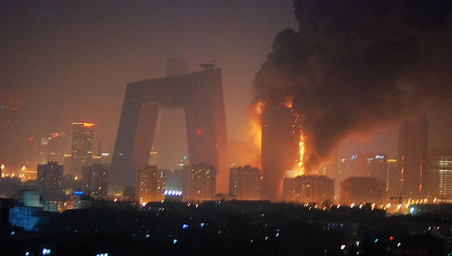
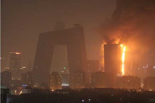
TVCC2 - Architecture must burn?
In Yukio Mishima's novel The Temple of the Golden Pavilion (Kinkaku-ji), the disturbed acolyte Mizoguchi burnt down the Golden Pavilion at the end. What he destroyed was far more than a physical structure. For Mizoguchi, it's a symbol of beauty, and desire. It embodies all the love, shame, disappointment, and anger in his life.
In the last couple of years several well-known buildings caught on fire, partially or completely damaged. Buildings always mean more to architects, just like parents understand better the value of life... Let's take a moment of silence and mourn the loss of tremendous physical and emotional devotions, the loss of beauty, and the loss of all the wonders they had created.
Monday, February 9, 2009
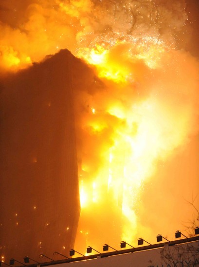
TVCC on fire!
Oh boy! Around 9pm Beijing time (8am Eastern time) today, TVCC caught on fire. Preliminary investigation says it's the firework on the last day of celebrations for the Chinese New Year... The fire went on for almost 4 hours. 54 fire trucks came to the site. 30+ people were rescued, and at least 7 people (6 fire fighters + 1 CCTV staff) were hospitalized. (Added 2/10: One firefighter died...) Estimated loss billions of dollars, not counting the endless hours of work on the design...
The entire morning there were floods of messages from different portals: emails, text messages, msn, google talk, skype, facebook chat... I was amazed how fast things travel in the architectural world.
Friday, February 6, 2009
Blink graphics
Emerystudio designed this cool wayfinding system for the carpark of Eureka Tower in Melbourne. The monumental words can be seen perfectly at certain key points. Otherwise they become ambiguous graphic fragments. The manipulation of perspetival distortion successfully addresses the notions of 2D (signage) vs. 3D (space), and staticity vs. mobility. When driving, you have to make decisions in a blink anyways, right?