Monday, August 30, 2010

When the Dougong was small

          
During the Shanxi trip, I saw many new constructions right next to major tourist attractions. A lot of them are contemporary expansions or additions to very old existing temples, but they try so hard to look like the old ones. I couldn't stop but wondering: why can't we just build something true to our time?

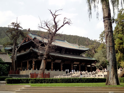
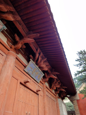
There are many examples of temple expansions in history. A very good one right in Shanxi is Jinci. Jinci Temple started during the Western Zhou Dynasty (1045-771 BC) and has got to what it is now through thousands of years' additions and replacements. Structures of different dynasties reflect different styles, techniques, and preferences specific to their time of construction. They don't even want to be in the same axial alignment. As a result, the whole complex becomes a rich library of historic sentiments, especially different types of Dougong - a key element of Chinese wooden construction - with variations in size, number, and decoration that have developed through time.

Plan of Jinci Temple in Shanxi, China
Saint Mother Hall (Song, 1023), oldest existing structure in Jinci Temple
The large Dougong of Saint Mother Hall
Offerings Hall (Jin, 1168)
Offerings Hall interior, with the Memorial Archway (Ming, 1576) on the left.
Mirror Terrace, the front and back parts were built separately in the Ming and Qing Dynasties.
When Ming style meets Qing style
Tangshuyu Temple, the Dougong was much smaller
Juntian Terrace built in the Qing Dynasty (18th century), the Dougong is very decorative.

When the Dougong was smaller, people were aware of the spirit of their times and wanted to express that architecturally. They didn't repeat the context with huge Tang/Song Dougong system. When we are building now, why do we just fake antiques by imitating the way old buildings look, but not learn from the way our ancestors think?

Maybe the question is what is a contemporary Buddhist temple? What are the transcendental aspects of Buddhism? The spirit of Zen? The pursuit of balance and harmony? In the Western world, a lot of contemporary churches are being built, with modern designs of architecture all the way down to objects like candle holders and chalices. Maybe for a contemporary temple, we should start with a new design of the incense burner.
              

Of wood and brick


Once upon a time, China was an empire of wooden structures. A trip to Shangxi Province made me extremely proud of my ancestors because of their superb techniques of engineering and construction.

One of the oldest preserved wooden structures is Foguang Temple, near Wutai. Its Great East Hall was constructed in 857 during the Tang Dynasty. (That was 1,153 years ago!) This is how it works structurally: the hipped roof frame sits on top of a series of columns with complex sets of brackets (called Dougong). The walls are not loading-bearing and there are large doors and windows. (Le Maison Domino??) The huge wooden bracket sets jump out four layers of arms, allowing the eaves to project almost 4 meters beyond the side of the walls. These brackets are fit together by joinery, without any glue or fasteners. Amazing precision and quality of carpentry!

The Manjusri Hall, another historic wooden structure in Foguang Temple, was constructed in 1137 during the Jin Dynasty. Without the "dropped ceiling" (Zaojing), we can see perfectly the structure of the roof frame.

100 kilometers away from Foguang Temple, stands the oldest wooden pergola in China - the Sakyamuni Pagoda of Fogong Temple in Ying County. It was built in 1056 during the Liao Dynasty. This 67-meter-tall fully wooden structure features 54 different types of Dougong, again, assembled with joinery, no glue or nails used. What a giant piece of 3D puzzle!

The most spectacular would be the Hanging Temple near Mount Heng. It was built 60 meters above the ground into a cliff. Seen from afar, it's like a relief carved on the surface of the mountain. Structurally, the buildings are supported on cantilevers. Horizontal holes were chiseled into the cliff, and square beams were inserted and wedged firmly in place. There are wimpy wooden poles under the buildings, but they were actually added after the buildings, more decorative (to make it look less scary) than structural.

Sunday, August 29, 2010

Of steel and glass I - Guangzhou Opera


After seven long years, Zaha Hadid's Guangzhou Opera House was finally open to the public this year. After visiting, I have mixed feelings about it...

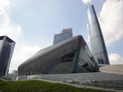
The twin boulder design makes the building quite an iconic presence on the Pearl River edge.

I don't understand why the "approach promenade" has to rise up right in front and ruin the best potential image of "two rocks on the pond."

The triangulated exterior stone cladding was very poorly built, seams are not even and the surface is not smooth, especially when it gets to the corners. I wonder if smaller scale tessellation would be better - like the mosaics of the Austria Pavilion at the Shanghai Expo perhaps?

The gap between the two boulders is less powerful as expected. It turns out to too wide to get the kind of tension as God and Adam's fingers in Michelangelo's Sistine ceiling.

Compared to the facade stone cladding, the construction quality of the exposed concrete of the "approach promenade" seems pretty good. But the space is kind of a Wolfsburg rip-off and I still doubt if it needs to be an elevated promenade in the first place.

The lobby shows perfectly how Zaha is the master of curves. The flowing quality of the sculptural shapes is very appealing. I think the steel grid is a bit over-structured though...

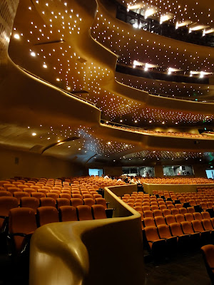
The auditorium is really impressive. Again, very Hadidean curves. The balconies and the acoustic/lighting equipments are well integrated into the overall fluid form. The star-like ceiling lighting adds to the fantasy atmosphere of the performance space.
In the other rock is the multi-functional hall. Similar space but black paint on the auditorium this time.