After seven long years, Zaha Hadid's Guangzhou Opera House was finally open to the public this year. After visiting, I have mixed feelings about it...
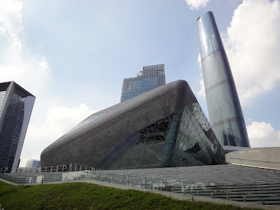
The twin boulder design makes the building quite an iconic presence on the Pearl River edge.


I don't understand why the "approach promenade" has to rise up right in front and ruin the best potential image of "two rocks on the pond."


The triangulated exterior stone cladding was very poorly built, seams are not even and the surface is not smooth, especially when it gets to the corners. I wonder if smaller scale tessellation would be better - like the mosaics of the Austria Pavilion at the Shanghai Expo perhaps?


The gap between the two boulders is less powerful as expected. It turns out to too wide to get the kind of tension as God and Adam's fingers in Michelangelo's Sistine ceiling.

Compared to the facade stone cladding, the construction quality of the exposed concrete of the "approach promenade" seems pretty good. But the space is kind of a Wolfsburg rip-off and I still doubt if it needs to be an elevated promenade in the first place.


The lobby shows perfectly how Zaha is the master of curves. The flowing quality of the sculptural shapes is very appealing. I think the steel grid is a bit over-structured though...


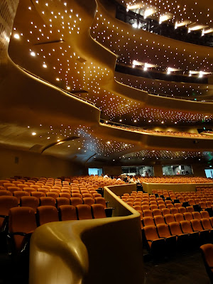
The auditorium is really impressive. Again, very Hadidean curves. The balconies and the acoustic/lighting equipments are well integrated into the overall fluid form. The star-like ceiling lighting adds to the fantasy atmosphere of the performance space.


 In the other rock is the multi-functional hall. Similar space but black paint on the auditorium this time.


No comments:
Post a Comment