Wednesday, August 25, 2010
Shanghai Expo - planning
I visited the Shanghai World Expo for three days. It was nice to see some funky pavilions and the dazzling exhibitions inside them. But on the urban level, it was rather conventional and boring.
One of the biggest hypes of the master plan is that the 5 km2 Expo Park occupies both sides of the Huangpu River. The concept (I think this was proposed by the students of Les Ateliers Internationaux in 1999) gives the planners a great opportunity to explore innovative connections between the river banks. But what's there now? Almost nothing. There's a subway line, but completely underground. There are ferries, but not running frequently enough. With the lack of urban synergy, the two sides are not working together as a whole. All they represent is a strong sense of separation and "otherness."
Talking about urban connectivity... ground transportation between the zones seems pretty lame as well. There are buses, like those in another other cities; and there are electric golf cars. That's it. I walked most of the time when I was there. But the lack of creative means of mobility frustrated me. There was the monorail in Montreal '67. What do we have now?
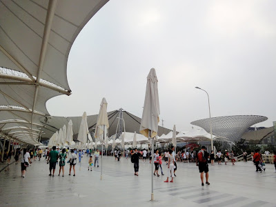
Another key concept of the master plan is an elevated pedestrian walkway system. But it doesn't really make sense to me. What is it elevated from? Not vehicular traffic obviously. There are no travelators providing a different speed either. So is it just pedestrians elevated from other pedestrians for the sake of standing higher? Or is it an alibi to mark an imposed urban axis with some substantial structure? Maybe it is to increase capacity...
Let's leave the axis and look at how the pavilions were placed. I understand it's hard to foresee what the countries would do with their pavilions, but it doesn't mean the layout can only be the most banal streets and blocks. More disappointingly, the street and block structure doesn't even form good urban spaces in the traditional sense. The streets are widened at some points to create the so-called squares, but as far as I can see, they are just empty spaces for nothingness. If Howard Stark sent his son (a.k.a. Iron Man) a message via the layout of Expo '64, what kind of message are we sending to the next generation with this one?
In a word, the Shanghai Expo master plan is too timid. The optimism and futuristic imagination that have characterized many previous expos are missing. Better city, better life? Boldness is what we need.


No comments:
Post a Comment