Probably the biggest exhibition-event outside of the main Salone is the "Mutant Architecture & Design" show organized by Interni in the courtyards of the Università degli Studi di Milano. The premise is that in the context of sustainability, design should find new strategies to allow transformation, adaptation, and reuse over time. So "mutant" means architecture that is "ready for changes, alterations and additions in its development and reutilization."
 |
| A map of all the installations |
Interni has brought together quite a group of big shots and hooked them up with leading manufacturers. The installations, however, turn out to be not so "mutable." Most of them are just formal interpretations of change and transformation. The temporal dynamics of evolution is frozen into a static gesture. Or to use Interni's words, the designers are just operating "on a metaphorical and symbolic level."
One of the first things you see upon arrival is MINI Sintesi by Anders Warming, general manager of MINI. Extruding in different directions is supposed to express MINI's principle of "same nucleus/genes, different individual characters." But honestly, I don't really know what it's doing.
 |
| MINI Sintesi. Anders Warming of MINI. |
Next to MINI is a series of urban furniture by the Japanese duo Setsu and Shinobu Ito. It seems to be just putting Verner Panton inside a sliced up shipping container, but at least the design touches the themes of "reutilization" and "adaptability."
 |
| Lib(e)ro. Setsu & Shinobu Ito with Art-Container. |
Jacopo Foggini's big blue ball has a strong presence in the courtyard. Its mysterious twinkling skin is made out of recycled polycarbonate scales. It's like a newly-born planet, radiating energy and awaiting a new future.
 |
| Plasteroid. Jacopo Foggini with Nice. |
Richard Meier's answer to mutation is a series of white concrete panels that twist in gradually changing angles. The dancing panels create a nice rhythm, and the whole installation takes on different forms depending on the angle it's viewed from. It's not kinetic but still produces interesting and dynamic spatial qualities. It seems the multiplicity of deformation is a good "low-tech" choice to express change.
 |
| Mutated Panels. Richard Meier with Italcementi & Styl-Comp Group. |
The Green Tower by Carlo Colombo plays a similar perspective game with stacked rectangular rings that rotate in different degrees. Inside, the vertical planting by Compagnia del Verde will literally change with seasons. Light coming from the irregular openings, casting changing shadows in the day. It's a vertical space for thinking, or maybe just relaxing.
 |
| Green Tower. Carlo Colombo with Arflex, Compagnia del Verde & Stratex. |
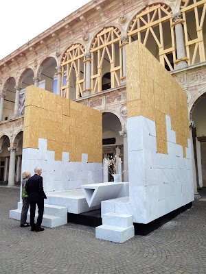
Mario Botta's contribution is an elegant chapel-like structure built with marble blocks. He wants to "take architecture back to primordial values." OK, let's all reverse evolution and go back to stone age.
 |
| Stanza. Mario Botta with GVM, Mapei & Riva 1920. (Above: Pensando l'Aquila. Michele de Lucchi with Corpo Nazionale Vigili del Fuoco & Riva 1920.) |
Snøhetta also uses marble: layering vertical pieces to form a cave-like space. The claim here is that shaping a void "is the only possibile mutation, the one that man can do by taking a raw piece of the earth and convince it to become as soft as a pillow." Is subtraction really the only possible mutation man can do? Can we really make marble into a soft pillow?
 |
| Zero. Snøhetta in collaboration with Paolo Armenise & Silvia Nerbi, with Carraramarmotec. |
In the corridor, Nendo's Zig-Zag shelves show a vision of malleability. The elegant simple modules can be assembled in a wide range of configurations. The design represents another threat of thought in reaction to the theme of flexibility and mutation.
 |
| Zig-Zag. Nendo with Lema. |
Dror Benshetrit's QuaDror also uses the "Go Modular" strategy. It can even be structure. What's demonstrated here is a screen wall application. The L-shaped pieces simply connect to one another with no additional joint parts.
 |
| QuaDror. Dror Benshetrit for More with Terra Moretti. |
Twirl by Zaha Hadid (or Patrik?) is in a smaller courtyard. The statement says, "Adapting to the natural contours of the courtyard and the forces that converge towards its center, the project emphasizes the slope of the arches, creating a powerful vortex of spatial distortion that favors dialogue with the surrounding colonnade." The way I see it? Yet another self-indulgent formal play with some computer program.
 |
| Twirl. Zaha Hadid Architects with Lea Ceramiche, lighting Artemide. |
In another smaller courtyard, Gwenael Nicolas creates a structure almost like a jelly fish floating in water. Naturally curved by gravity, the fibers dance when there's a breeze or touched by a visitor, as if they have come to life.
 |
| Suspended Colors. Gwenael Nicolas with Deborah Milano. |
My favorite piece is Ingo Maurer's Ablaze - sentimento (s)travolgente. It resembles the gradual transformation of a burning building. The distorted cabin is rough and black on the outside and intensely red inside. On the floor, there's an opening in a contrasting bright green color. A slick oval pendulum moves slowing, reflecting the surrounding colors and expressions of people peeping from the windows - curiosity, surprise, and awe. A hidden smoke machine occasionally gives out smoke from inside the cabin, adding theatrical effect to the already sentimentally intense piece.
 |
| Ablaze - sentimento (s)travolgente. Ingo Maurer with Enel. |


No comments:
Post a Comment