Saturday, May 21, 2011
E-books or p-books?
Amazon announced on Thursday that they are selling more e-books for Kindle than print books (p-books) - hardcover and paperback books combined. Since April 1, 2011, Amazon has sold 105 e-books for every 100 print book. That includes sales of hardcover and paperback books that have no Kindle edition, and not counting free Kindle downloads. This is not even four years since Amazon started the Kindle business in November 2007, and less than one year after they announced that e-book sales surpassed hardcover book sales last July.
This is definitely a significant milestone. But to be honest, I haven't really figured out how I feel about this. I love the physical existence of p-books (hence also known as "real books"). There is the irreplaceable intimacy of feeling it as an object: look, touch, and sometimes smell the fresh ink. But I enjoy my iPad a lot as well. E-books are compact, lightweight - convenient to carry around. They are cheaper and you can get them right away, in the comfort of your own home or on the go. But it's always fun to physically be in bookstores and browse around real books. You can flip through the pages and get a quick idea about the content. It's easier to write notes on the margin of p-books, but e-books are easier to search and the highlight function is really powerful. And the built-in dictionary allows you to check out definitions of words with just one touch.
The most amazing thing about e-books for me is the interactive dimension of the format. Many magazines embed multimedia materials like slideshows, audio and videos in their digital edition, enriching the experience of reading and revolutionizing what we perceive as the publishing industry.
It may look ridiculous nowadays to carry scrolls of papyrus around. But some of them have survived the evolution of technology because they contain valuable original knowledge. Continue this thinking of the basics, both p-books and e-books allow you to do the most important thing - to read a book. The essence is the content. Maybe it doesn't really matter so much what form it takes.
Tuesday, May 10, 2011
We lost a good architect
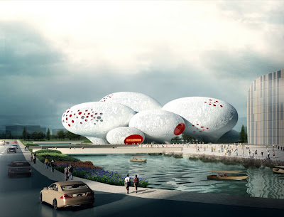
When I saw the recently released winning entry of Comic and Animation Museum by MVRDV, I was very tempted to list it with the other literal buildings I gathered. It's a museum about comics, so let's make it with speech balloons!
 |
| Comic and Animation Museum, Hangzhou, China |
Again and again, MVRDV's recent projects made me shiver with the thought that they were trapped in the cheap side of today's design culture and becoming less and less relevance. Four major symptoms:
1. Literal reference
The reference to speech balloons is very literal. What's even worse is that the building form is a literal translation of that. I've expressed many times my thoughts on literal design - no need to say more now.
2. Superficial wallpaper
One of the first lessons we learn from school is that architecture is not just about how it looks on the facade. But some architects today are quite satisfied with only dealing with the envelope, and are even trying to make a theory out of that. MVRDV doesn't seem to be immune to this fad. The Teletech call center in Dijon, for example, uses a cheap printed wallpaper facade to communicate "the activities of the company." 2D barcode? Give me a break.
 |
| Teletech Call Center, Dijon, France |
3. Repeated cliché
The "Future Towers" (Amanora Hills) in India is a chimera of outdated fashion. Apartments mixed with amenities; hexagonal grid plan; raked roofs with balconies; concrete grid facade with punched windows... Is there anything news? We should probably call this project "Past Towers" instead.
 |
| Future Towers, Pune, India |
4. Careless randomness
At Berlage, Winy Maas is pushing very hard the hyper-rational design process with game theory. At MVRDV, he's producing design with complete randomness: apparent chaos with no underlying logic. The Tirana Lake master plan project from a few years ago is the best example.
I planned to put "ugliness" as the fifth symptom, because it can be seen pretty much in all the projects mentioned above. But on second thought, I left it out. It's more a matter of taste after all. Maybe some people would actually think they are beautiful...
10 years ago, many of us were fascinated by the team of young Dutch architects. It was refreshing to see the dynamic spatial energy of Villa VPRO, the innovative sandwich of the Dutch Pavilion at the Hanover Expo, and the insightful studies on density in FARMAX. But now, I think we've lost them.
Sunday, May 8, 2011
Bipolar society
This is the front page of the latest Weekly Telegraph. The juxtaposition of the two pieces of news makes a compelling example of the status of our culture: the two poles of hard and soft stories, conflicts and fantasies. When you turn on the TV, you see news about Egypt, Libya, and Syria. Then switch the channel, voila! American Idol! Well yeah... Let's go watch Thor.


