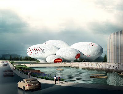
When I saw the recently released winning entry of Comic and Animation Museum by MVRDV, I was very tempted to list it with the other literal buildings I gathered. It's a museum about comics, so let's make it with speech balloons!
 |
| Comic and Animation Museum, Hangzhou, China |
Again and again, MVRDV's recent projects made me shiver with the thought that they were trapped in the cheap side of today's design culture and becoming less and less relevance. Four major symptoms:
1. Literal reference
The reference to speech balloons is very literal. What's even worse is that the building form is a literal translation of that. I've expressed many times my thoughts on literal design - no need to say more now.
2. Superficial wallpaper
One of the first lessons we learn from school is that architecture is not just about how it looks on the facade. But some architects today are quite satisfied with only dealing with the envelope, and are even trying to make a theory out of that. MVRDV doesn't seem to be immune to this fad. The Teletech call center in Dijon, for example, uses a cheap printed wallpaper facade to communicate "the activities of the company." 2D barcode? Give me a break.
 |
| Teletech Call Center, Dijon, France |
3. Repeated cliché
The "Future Towers" (Amanora Hills) in India is a chimera of outdated fashion. Apartments mixed with amenities; hexagonal grid plan; raked roofs with balconies; concrete grid facade with punched windows... Is there anything news? We should probably call this project "Past Towers" instead.
 |
| Future Towers, Pune, India |
4. Careless randomness
At Berlage, Winy Maas is pushing very hard the hyper-rational design process with game theory. At MVRDV, he's producing design with complete randomness: apparent chaos with no underlying logic. The Tirana Lake master plan project from a few years ago is the best example.
I planned to put "ugliness" as the fifth symptom, because it can be seen pretty much in all the projects mentioned above. But on second thought, I left it out. It's more a matter of taste after all. Maybe some people would actually think they are beautiful...
10 years ago, many of us were fascinated by the team of young Dutch architects. It was refreshing to see the dynamic spatial energy of Villa VPRO, the innovative sandwich of the Dutch Pavilion at the Hanover Expo, and the insightful studies on density in FARMAX. But now, I think we've lost them.


4 comments:
I felt the same way as you did, shocked and disappointed. When I was a graduate I was really inspired by their work .......
http://www.dezeen.com/2011/05/20/alphabet-building-by-mvrdv/
check this out - yet again... i am speechless.
did you see their latest masterpiece?
http://www.dezeen.com/2011/05/20/alphabet-building-by-mvrdv/
oh nvm...i didn't see the comment above
Post a Comment