Friday, May 18, 2012

Milano’12: Architects action

       
As a tradition, Milan Salone was not only a hotspot for celebrated product designers, but also a playground for starchitects. Many architects had “crossed the line” and developed new products with different name brands, both for the buildings they designed and as mass marketed objects.

At the Fairgrounds, Jean Nouvel presented the Mia collection for Emu. These simple and elegant stacking metal chairs and tables were originally for the restaurant of the RBC Design Centre that Nouvel designed in Montpellier. The Molteni&C stand featured the Arc dining table by Foster + Partners. The double-curved base made of a composite material of cement and organic fiber attracted quite a few eyeballs.

Emu’s MIA collection by Jean Nouvel
Arc table by Foster + Partners for Molteni&C

In Brera, Shigeru Ban showcased Module H, a modular system of aluminum panels he developed for Hermès, of course with a perforated pattern composed of the letter H. It could be used to surface existing walls or as free-standing partition screen. The idea is that the repetitive pattern allows you to hang anything on the wall in all kinds of combinations. Aren’t most of the shelves in stores doing that just as well?

Shigeru Ban’s work was also featured at the showroom of When Objects Work (WOW), alongside that of John Pawson and Belgian architect Vincent van Duysen.
Maru by Shigeru Ban
Tableware by John Pawson
Pottery by Vincent van Duysen

Paola C. Gallery presented a series of wooden objects made by the craftsmen of Studio Mumbai. These curious looking bowls and pots were the result of an almost impossible collaboration: Studio Mumbai founder Bijoy Jain and Aldo Cibic, Italian design guru who was part of the postmodern Memphis group.
Wooden objects by Bijoy Jain and Aldo Cibic

The most high profile in Brera this year was probably Zaha Hadid’s “Secret Garden” pavilion with marble producer Citco. The overall fluid gesture of the pavilion looked clever, framing large milled marble murals with cuts and folds. Yet the simple but most important detail – how to fix these pieces onto the structure – was not thought through at all. The inlaid marble surfaces were obvious parametric geometry exercises; but what’s more than that? What are they for? The description claimed that they established a dialogue between nature and architecture: “These fascinating scenarios are established when energy is applied to geology – developing a geometric set of repeated cycles of growth or erosion that have been superimposed onto the immaculate marble.” Hmm, sounds like Patrik talking.

When I first heard that David Adjaye would design some products with Swarovski, I was a bit worried. Bling bling! But to my relief, the Star vessels were very subtle, elegant, and delightful to see. Handmade in Turkey, these objects were lined with black crystals only on the inside, while the copper exteriors were perfectly smooth. “This inversion creates an elemental quality that comes alive as the crystals subtly catch the light from within,” Adjaye said.
Star vessels by David Adjaye

Adjaye’s mentor David Chipperfield was featured in the Marsotto Edizioni showroom in the MonteNapoleone area. His Colonnade was one of the new tables presented. Curious enough, this long table and all the other tables (designed by Konstantin Grcic, Naoto Fukasawa, Jasper Morrison, and James Irvine) looked extremely similar. I guess it was the white Carrara marble and the identical matt polished finish.
Colonnade table by David Chipperfield
Konstantin Grcic (left) and Naoto Fukasawa (right) also for Marsotto Edizioni

On via MonteNapoleone, the Chipperfield-designed Valentino flagship store had an “open house” to show the new store concept. A succession of areas with distinct atmospheres stretched in smooth harmony, thanks to a carefully developed material palette: grey terrazzo, marble in black and white checkerboard pattern, wood, glass, sandblasted mirrors, leather, etc. It was very refined and elegant, yet very plain and hollow. Typical Chipperfield “Tofu Architecture” (as Jin described it): tasteful because of all the add-ons but dull in essence.

A few blocks away, the recently completed Duvetica store hosted an exhibition on Tadao Ando, the architect behind their own retail space. 10 museum projects, including the Punta della Dogana Contemporary Art Center and Palazzo Grassi in Venice as well as Lee Ufan Museum and Chichu Art Museum in Naoshima were presented. I had not been following Ando’s work for so long that I actually saw most of the projects for the first time! His Château la Coste projects in Provence looked quite nice. I felt I should pay a visit to the French region. To my surprise, I saw a twisting form in the Abu Dhabi Maritime Museum. I guess Abu Dhabi makes everybody crazy – even Tadao Ando couldn’t resist the temptation.
Tadao Ando exhibition in the basement
Abu Dhabi Maritime Museum
       

Thursday, May 17, 2012

Milano’12: The future lies in technology

     
Aiming to create a new epicenter in Milan during the Salone, Tom Dixon made the MOST debut at the Museo Nazionale della Scienza e della Tecnologia. Dubbed the acronym of “Museum of Science and Technology,” MOST meant not only the venue, but also the theme. The show demonstrated the influence of technology on design, in terms of both materials and manufacturing processes.

At the via Olona entrance, Dezeen set up a temporary studio for press and interviews, powered by Jambox – a small wireless speaker designed by Yves Behar. The space was furnished by Tom Dixon, inspired by the legendary Factory with sheets of aluminum foil on the wall.

Dezeen studio with Tom Dixon’s Copper Shades

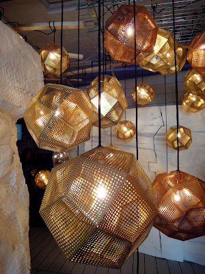
Tom Dixon’s “Luminosity” show displayed his new lighting products in a series of four interconnected tunnels. The journey began in the Mirror Maze with Fin Lights. Then there was Etch Web, a large sphere made with open irregular pentagonal structure; and Etch Shade, sheet metal perforated with a gradient pattern. These digitally manufactured objects were nothing unheard of. But the dramatic shadows and intricate lighting effects were quite amazing.
Fin Lights
Etch Web
Etch Shade
Stamp Light

In the Air and Water Building, there was a pop-up soda bar next to the brigantine and the trans-Atlantic liner in the museum. SodaStream offered free soda drinks with no plastic bottles on site, thanks to the elegant soda machine designed by Yves Behar as a reimagined home carbonation system.
SodaStream soda bar
The reimagined SodaStream machine by Yves Behar

In this amazing 1970s structure, there was also a mini exhibition organized by Transnatural. Operating at the intersection of art/design and science/technology, Transnatural explored innovative mechanisms that play by the dynamic rules of nature, including material chemistry, magnetic forces, and gravity.
Transnatural exhibition
Organic Benches and Stools by Ruben Thier
Gravity stools by young Dutch designer Jólan van der Wiel,
who invented a machine to form furniture with liquid magnet.
Thermophores by Tim van Cromvoirt. Its colors change with temperature.

In the Railway Pavilion, the German company TRUMPF had two sheet metal machines running to punch and fold chairs and lights on site. It exposed the back stage scene of how the Tom Dixon Stamp products were made.
TRUMPF machines

Quinze & Milan and David Weeks blew up the original puzzle toy Cubebot twenty times in size and created a lounge chair with the classic Q&M sponge. It was quite an imposing giant, but it gave a smile on the face of everyone who passed by.
Cubebot lounge by Quinze & Milan and David Weeks

At the Co-design Bar, Digital Forming set up several workstations powered with their “Co-design” platform, allowing visitors to participate in the design process of Tom Dixon lamps and speakers. Once happy with their adaptations, visitors could place an order and got the 3D printed product delivered to their home within two weeks.
3D printed lamp shades
3D printed speaker covers
In Spring Table restaurant, people viewed the menu and ordered on Nokia’s newest smartphone.

Inside the old monastery, young designers were presented in an almost bazaar-like atmosphere. British architect Sally Mackereth showed her CAST 001, a range of outdoor furniture formed by a special casting technique. The material seemed like a mixture of stone and metal, with a shagreen texture and a bronze patinated finish.
CAST 001 by Sally Mackereth
Super-able Table by Ashley Temudo

Another interesting thing was the Flux chair. When flat, it looked like a giant moth. While folded, it turned into a polypropylene chair. It got quite funny when they had concrete or metal texture printed on them.
Flux chairs
Flux chairs with printed textures

If MOST was still artistic, showcasing how technology was used by talented designers to create beautiful objects, The Future in the Making exhibition organized by Domus and Audi had more of a raw touch. It focused on the conceptual dimensions, examining the meaning of open crowd-sourcing design culture. As Domus editor-in-chief Joseph Grima pointed out, “We are in the social media era where sharing and collaborating are essential. It’s not about secrets any more.” Everyone is part of the design process. The exhibition raised questions like “What if furniture is downloadable?” and featured new products made possible by the crow-funding platform kickstarter.com. The curators intentionally chose the Baroque Palazzo Clerici; and in high contrast, they turned this formal architecture into a vibrant factory, or a lab.

In the courtyard, Audi and designers Clemens Weisshaar and Reed Kram invited visitors to sit in their R18 Ultra Chair – Public Beta. Hundreds of stress-analysis sensors integrated into the prototype captured every movement and simultaneously displayed it as a colored force diagram. The installation thus harvested crowd-sourced data that would be fed into the chair’s design parameters, and the designers would make necessary adaptations in the final product scheduled to be presented at Design Miami in December.

Audi’s R18 TDI race car in the courtyard of Palazzo Clerici
R18 Ultra Chair – Public Beta
Simulated force diagram

In the Open Design Archipelago, Domus brought together a selection of designers, companies, and platforms that engaged in reshaping the philosophical, technological, material, and commercial frameworks of the design profession.
FabLab Torino/ Vectorealism Workshops

Dutch designer Dirk Vander Kooij operated his “Endless” robot and printed furniture on site, using recycled materials from old electrical appliances.
Dirk Vander Kooij’s “Endless” robot
The printed “Endless Furniture”

Droog didn’t present any product. Instead, they put up a show of new ideas. Optical World, a shop that sells illusions to reduce your material burden; Second Hand, a large, well-organized chain of specialized second-hand stores; Wild Goods, lead supplier of products made of natural remains; Play Shop, a game to satisfy your need for shopping without actually buying anything; Sea Treasures, a studio that makes products by fishing plastic from the sea; Solar Sinter, a device that uses sunlight and sand to print products in the desert... Real or imagined, these visionary concepts were answers from Droog for a “Future Furniture Fair.”
“Material Matters – A Future Furniture Fair” by Droog

The highlight of the Domus show was the richly decorated dining room. In the middle of the long table was a curious machine. “What if avant-garde gastronomy were the next frontier of 3D printing?” In a side room (kitchen?), Spanish architect José Ramon Tramoyeres of GGLab demonstrated how to apply 3D printing technology to haute cuisine. The machine made it easy to manipulate the recipe and adjust to the tastes of different customers. But in my opinion, the printed cookies and chocolates looked kind of plasticky.
The dining room
3D printed food

We have seen technology reshaping our civilization through every step in history. The digital revolution has opened up many new possibilities in design. The question is, when will all these new technologies pass the super-geek circle and become more usable and accessible?