Japan is definitely a country with strong and unique design sensibilities, if not the best. Generation after generation, design talents on those islands have built up an empire of exquisite products – simple and calm, yet creative and visionary.
Some call simplicity and calmness zen-like qualities. This year in Milan, Tokujin Yoshioka presented his new Luminous table for Glas Italia. This completely transparent table with solid glass structure made me think that it had just come out from an Apple store. Right next to it, I actually found the Bent Glass Bench and Bent Glass Table by Naoto Fukasawa more interesting. The extraordinary load resistance coexisted with an organic form that evoked a soft and light appearance. The continuous surface with natural curvatures looked more elegant than the hard glued corners of Luminous.
 |
| Luminous by Tokujin Yoshioka |
 |
| Bent Glass Bench and Bent Glass Table by Naoto Fukasawa |
In the Triennale garden, Yasushi Matsumoto constructed a mysterious installation called “Upside-down, Fusion of the Image and the Interior in Dim Light.” From the outside, it was only a wooden box with some bubbles on the wall. When inside, you’d find yourself in a large camera obscura! Those bubbles filled with water worked as analog lenses, projecting upside-down images of the surroundings onto a translucent screen on the interior wall. It was simple physics, but truly amazing. I enjoyed a moment of binary spirits: old and new, motion and stillness, light and shadow, inside and outside, reality and imagery.
 |
| Yasushi Matsumoto’s installation in the Triennale garden |
 |
| Images projected on the interior wall |
 |
| A demonstration of how a camera obscura works |
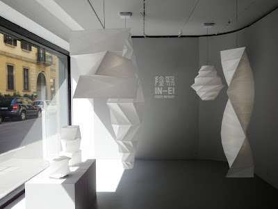
The zen-like elegance peaked at Issey Miyake’s IN-EI series for Artemide. The collection includes free-standing, table, and hanging lights, adopting the unique mathematical principles of folding Issey Miyake and his Reality Lab. developed for the latest “132 5. Issey Miyake” line of clothing. Titled as the Japanese word for shadow, these peculiar geometries play with translucency and multiplicity of solidity. A Junichiro Tanizaki quote in the catalogue describes it perfectly: “Beauty lies not in objects, but in the interaction between the shadow and light created by objects.”
 |
| HE 016 |
 |
| TR 001 |
 |
| TR 008 hanging and SQ 004 on the table |
To be pure and elegant is one thing; to be unexpected is another. The one designer I found who can take the Japanese minimal aesthetics to a higher level is Nendo. They make simple objects, yet they never cease to surprise me.
The Zabuton chairs for Moroso, for example, have seemingly heavy puffy cushions lazily lying on very thin metal frames. Instead of seeking precision within the Western paradigms of rational beauty, Nendo embraced asymmetry and imperfection. On an armchair, the cushion was put casually towards a corner, breaking the coordinates set up by the rigid structural frame. A similar thin frame was folded like the Japanese screens in the Byobu table launched at the same time at the Moroso stand.
 |
| Zabuton futon and Byobu tables |
 |
| Zabuton armchair |
The same “heavy-on-thin” effect was seen again when I entered Nendo’s K% The Black & Black Collection show in Zona Tortona. Next to the concrete-on-thin-legs Heavy tables, three chairs were dancing in a line. The Melt chair has a continuous 3D curve from the back legs through the backrest, arm and front legs, forming a shape that changes from different angles. So are the Timber stools. When I first saw people sitting on them, I thought the chairs were about to crack. Then I realized it was just my view angle had made them look completely out of balance. One of the most brilliant was Scissors, a magazine rack formed of flat steel bars arranged on a dia-grid with slight variance on the Z plane. It took some brain-power to figure out that the magazines were held in place in the spaces created between those non-coplanar bars.
 |
| K% The Black & Black Collection with the Weave screen in the middle |
 |
| Heavy tables |
 |
| Melt chairs |
 |
| Timber stools |
 |
| Scissors magazine rack |
Also in Zona Tortona, Bisazza launched the Nendo bathroom collection. It included counters, cabinets, a tub, and accessories like hanger stands, wall clocks, and flower pots. Classic Nendo clean and simple geometries, and at the same time they look cozzy thanks to the warm hue of larch wood.
 |
| The Nendo Collection for Bisazza Bagno |
 |
| Counter A and Mirror B |
 |
| Flower Pots A, B, C, D |
 |
| Sliding Cabinet A reinvented the definition of drawers |
The most striking aspect of Nendo’s design is that they are able to combine the zen-like qualities with kawaii – the Japanese cuteness. Growing Vases for Lasvit, displayed at Spazio Rossana Orlandi this year, looked like a cluster of lovely fruits. (It made me think of the tea and coffee set SANAA made for Alessi.) In fact, this chandelier makes more sense because the shapes are results of displaying the metal pipes used by glassblowers, still attached to the glass objects that they were used to make. Nendo turned the pipes into flowers and branches, and the blown glass object into a vase.
 |
| Growing Vases for Lasvit |
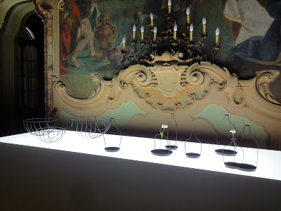
The highlight of all Nendo’s presence in Milan this year was the Trial & Error show at Palazzo Visconti. The title spoke of the nature of a constant experimentation, but the show collected the fruitful results of over 10 years of hard work. There was a room full of the Thin Black Lines collection. In some objects, the three-dimensional lines seemed to be flattened by space, confusing the perceptions of in front and behind, and generating shifting forms as the viewer moved around them. While in some others, the 2D lines expanded and suggested a volume. As Oki Sato put it, “Multi-faceted and constantly morphing, they move alternately between the becoming and collapse of form.”
 |
| Thin Black Lines collection |
 |
| Thin Black Lines collection tables |
 |
| Thin Black Lines collection chair |
 |
| Thin Black Lines collection bowls and vases |
 |
| Visible Structures adhering the carbon fibers to the surface of polystyrene foam forms to achieve the strength necessary for chairs |
 |
| Object Dependencies, a series of “structurally incomplete” furniture |
In another room, a series of pumpkin-shaped lanterns were hung against a wall. They were made by heat-forming agricultural nets ordinarily placed around fruit and vegetables to prevent them from harm by wind or animals. Nendo found the material stronger than organdy but more flexible than wire mesh, which allowed them to create a thin membrane that stands independently, but also floats gently on a breeze. The resulted lamps were so delicate and adorable. I so wanted to touch them, but was afraid that they might break.
 |
| Farming-Net collection |
What’s consistently amazing in Nendo’s work is this perfect balance between zen-like simplicity, ingenious unexpectedness, and cute personality. When Steve asked me who stood out from what I saw in Milan, I answered with little hesitation: Nendo.


1 comment:
who is steve?
Post a Comment