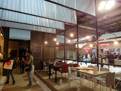
To stand out from the sea of stands at the Salone is not easy. Brands tried their best to make their display special. Casprini put their different lines of products in different cases, Pedrali introduced wheels of furniture, Natuzzi wrapped their stand with a striking pattern, and Gaber made huge colorful light fixtures over their space.
 |
| Casprini stand |
 |
| Pedrali stand |
 |
| Natuzzi stand |
 |
| Gaber stand |
Gruppo Sintesi’s Ideas Village was probably the most impressive at the Fairgrounds. Developed by Italian architect Roberto Leone of Design Bakery, it was a series of wooden structures with a central square, evoking the feeling of a collective group of industrial workshops for design, craft, and trade. The various brands and product lines of the group were housed within. And the outside wall were constantly marked by several street artists, injecting some hip energy and creating a sort of spectacle that made people stop and watch.
 |
| Gruppo Sintesi: The Ideas Village |
 |
| Street artists working on the outside walls of the Idea Village |
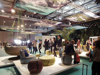
Walking around the Fairgrounds could be very exhausting. Some brands understood the opportunity and created a relaxing environment for people to hang out and rest. Outdoor furniture brand Dedon set up a tropical forest with their products. Edra, a brand who views “unexceptionable comfort” as aspirations for form creation, offered their seating devices for people to try on. People seemed to really enjoy them, especially the exotic-looking pieces designed by Fernando & Humberto Campana.
 |
| The Bunny Chair by Iskos-Berlin for Normann Copenhagen |
 |
| Dedon stand |
 |
| Nestrest by Daniel Pouzet & Fred Frety for Dedon |
 |
| Edra stand, with Aster Papposus by Fernando & Humberto Campana in the middle |
 |
| Boa by Fernando & Humberto Campana |
 |
| Cipria by Fernando & Humberto Campana |
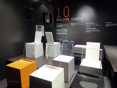
After last year’s extravaganza, Kartell put up a rather educational show this year. Titled “Work in Project,” the stand focused on the products themselves, revealing the various phases of their creative genesis: from design to prototyping up to industrialization. One after another, Skype ringtones came from the screens on the walls – the masterminds behind the products were calling to explain the ideas.
 |
| Kartell stand at the Salone |
 |
| Patricia Urquiola’s Foliage and the prototypes |
 |
| Masters chairs by Philippe Starck with Eugeni Quitllet |
 |
| Oui tables by Ferruccio Laviani |
 |
| Audrey chairs by Piero Lissoni |
 |
| Various mock-ups showed the design process of Philippe Starck’s Miss Less chairs |
 |
| The Invisibles collection by Tokujin Yoshioka |
Outside of the Fairgrounds, Kartell went rock in their flagship store. American rock icon Lenny Kravitz reimagined the Mademoiselle armchair originally designed by Philippe Starck, and created six new ones with exotic finishes such as python, fur, leather, and woven materials. Kartell showed them as the stage set for a rock party.
 |
| Kartell flagship store |
 |
| New Mademoiselle armchair by Lenny Kravitz |
To celebrate its 60th year in the business, Moroso invited Chinese architect Zhang Ke of Standardarchitecture to pimp up their showroom in Brera. Titled “The way of the Water Dragon,” the installation was entirely flooded in red light. In the middle was the red “Hidden Dragon” sofa, surrounded by an abstract ink-water calligraphy work on foldable screens. There were even soundtracks from In the Mood for Love playing in the background! Compared to the mysterious atmosphere created by Tokujin Yoshioka last year, this year’s scenography looked clumsy and pretentious, abiding by any possible stereotypical concept the West may have on Chinese culture.
 |
| Moroso showroom |
 |
| Blur sofa by Marc Thorpe for Moroso |
Laufen asked their fellow Swiss designer Atelier Oï to set up their showroom in Zona Tortona. With unexpected arrangements, the installation turned basins and toilets into artistic expression, celebrating the art of Swiss creativity and craftsmanship.
 |
| Laufen showroom |
At the Triennale, Czech glass manufacturer Lasvit presented an innovative glass wall system Liquidkristal developed with British designer Ross Lovegross. It’s an interesting material with great potentials, but the pavilion didn’t live up to the magic. The patterns looked random (as opposed to all the digital precision of the material), and the shape seemed completely out of proportion (yes, I mean compared to SANAA or Ishigami). The Swarmology digital video by Biothing on the ceiling didn’t help making sense either.
 |
| Liquidkristal by Ross Lovegross for Lasvit |
Interface didn’t seem to like showing their carpets on the floor. After putting them on top of prism columns last year, they decided to mount them on vertical surfaces this year. Still collaborating with Milan-based designer Francesco Maria Bandini, Interface showcased their new Metropolis series with curved mountain-shaped profiles that symbolized constant regeneration and post-apocalypse rebirth. Maybe last year was just so good; I found this year’s edition a bit underwhelming, even with all the lighting and sound effects.
 |
| Interface’s Metropolis show |
Corian was going austerity this year. No big stars like Zaha or Nouvel. The long line last year for the Tron show didn’t happen this year. In a small room in Zona Tortona, Corian put up an exhibit called “Color Evolution” to show Corian can be colorful. Frankly, nothing really wowed me there.
 |
| Corian showroom |


No comments:
Post a Comment